A UI/UX portfolio is not just a gallery of pretty screens. It is proof of how you think, what problems you can solve, and whether you can present your work with enough clarity for someone to trust you with real product decisions.
That is why recruiters do not only look for polished visuals. They look for evidence of structure, decision-making, usability awareness, and communication. A strong portfolio makes those qualities easy to recognize quickly. A weak portfolio hides them, even when the work has potential.
If you are still building your core design foundation, the related article on UI UX design skills, fees, and career opportunities gives useful broader context. This article focuses specifically on turning your portfolio into a much stronger hiring asset.
01 Start With Fewer Projects, but Make Them Stronger
One of the most common portfolio mistakes is adding too many average projects. Recruiters do not need ten weak case studies. They need a smaller number of projects that show clear thinking, good visual judgment, and believable execution. Three to five strong projects is often enough.
A tighter portfolio also helps you focus your effort. Instead of spreading attention across too many pages, you can improve storytelling, polish, and clarity in the projects that matter most.
"A portfolio becomes stronger when each project earns its place."
02 Show the Problem Before the Solution
Many portfolios jump straight into screens and mockups. That makes the work harder to evaluate because the viewer does not know what challenge you were solving. Good case studies usually begin with context: what the product, audience, or problem was, and what needed improvement.
This matters because design is not decoration. It is decision-making under constraints. The more clearly you frame the problem, the easier it is for recruiters to understand the value of your solution.
A Better Case Study Opening Usually Includes
- The product or project context
- The user or business problem
- Your role in the work
- The scope or timeline if relevant
- What success needed to look like
03 Make Your Process Visible, but Keep It Clean
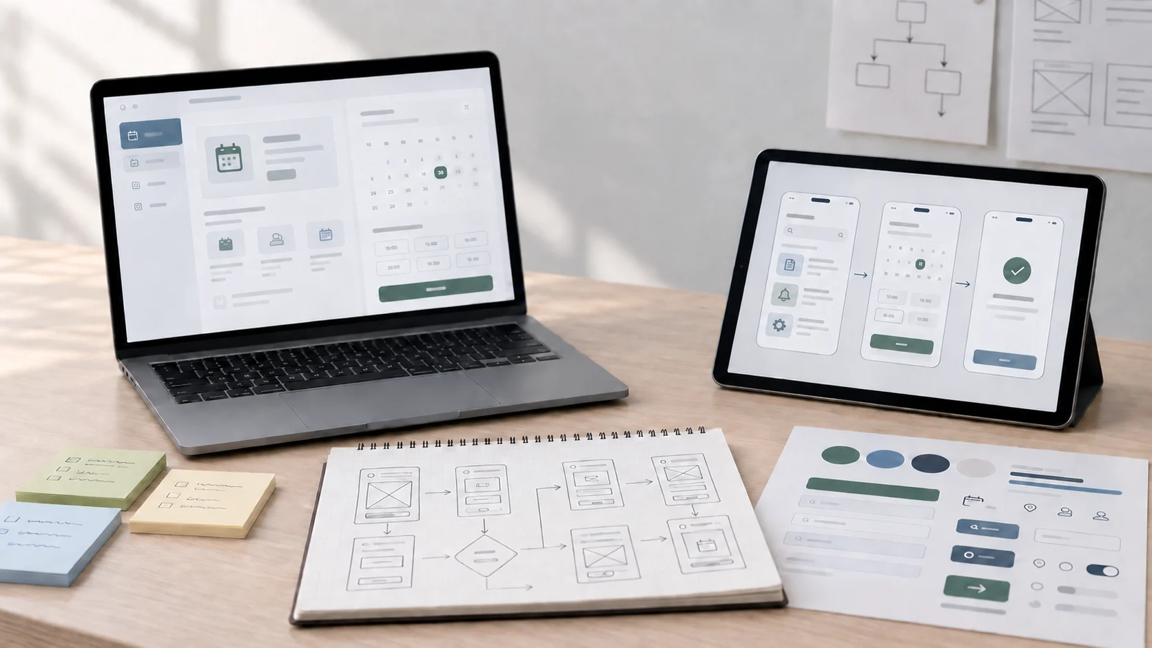
Recruiters want to understand how you move from problem to solution, but that does not mean dumping every note, wireframe, and screenshot into the page. The best portfolios show process selectively. They reveal the thinking without creating clutter.
That might include a few research insights, key wireframes, usability considerations, iteration points, or before-and-after comparisons. The goal is to show that your decisions came from reasoning, not randomness.
04 Write Like a Designer Who Can Communicate
A portfolio is also a communication test. If your writing is vague, generic, or full of buzzwords, the work can feel less credible. Clear writing makes your thinking easier to trust. It helps recruiters understand your role, your decisions, and why the project matters.
You do not need long paragraphs everywhere. In fact, shorter sections often work better. What matters is that the reader can move through the project without getting lost.
Portfolio Writing Should Feel
- Specific instead of generic
- Structured instead of scattered
- Honest instead of exaggerated
- Easy to scan on the first pass
- Detailed enough to reward deeper reading
05 Show Outcomes, Not Just Screens
A project becomes much more convincing when you explain what improved. That might be better clarity, stronger task flow, fewer friction points, better information hierarchy, or more confident mobile usability. You do not always need big metrics, especially as a beginner, but you should still describe the result of your design decisions.
This is one reason understanding why user experience is important helps portfolio quality too. When you think in terms of user impact, your project presentation becomes much more meaningful.
"Beautiful screens attract attention. Clear evidence of better thinking earns trust."
06 Make the Portfolio Easy to Scan
Recruiters often review many candidates in limited time. If your portfolio is hard to scan, too text-heavy, or visually chaotic, strong work can get missed. Good structure helps your projects survive that first skim.
Use clear headings, clean spacing, intentional image sizing, and logical section order. Your portfolio itself should reflect interface clarity, not just talk about it.
Simple Ways to Improve Portfolio Scanability
- Use strong project titles and section headings
- Lead with the most impressive project
- Break long text into short readable sections
- Use visuals that support the story, not distract from it
- Keep navigation and layout consistent
07 Be Honest About Your Role and Project Type
Recruiters can usually sense when a portfolio overstates reality. If a project was self-initiated, say that clearly. If it was a redesign concept, explain that honestly. If it was a team project, mention what part you handled. Honesty makes the work feel more credible, not less.
This is especially important for beginners. You do not need fake client stories to look professional. What you need is evidence that you can think clearly and present your work responsibly.
08 Your Portfolio Should Reflect the Kind of Designer You Want to Become
A strong portfolio is not just a record of what you made. It is a signal about where you are heading. If you want UI-focused work, show stronger interface craft. If you want UX-heavy roles, make your process and reasoning more visible. If you want product design roles, highlight systems thinking and decision tradeoffs.
That kind of intentionality makes the portfolio feel shaped, not random. If you are looking for a more guided learning path before refining your portfolio further, the Professional UI/UX Design AI Powered Workflow Program is the most relevant course route currently on the site.
09 What Recruiters Actually Notice First
Before they read deeply, recruiters often notice your project selection, visual clarity, layout discipline, professionalism, and whether the work feels thoughtful or generic. That means your first impression is shaped by both design quality and editorial judgment.
The portfolio that gets remembered is usually not the loudest one. It is the one that feels clear, credible, and intentional from the first screen onward.
A UI/UX portfolio that recruiters cannot ignore is built on stronger project choices, clearer storytelling, more honest case studies, and better evidence of thinking. Screens matter, but explanation matters too. When the work is easy to scan, grounded in real problems, and presented with clarity, your portfolio becomes much more than a showcase. It becomes a reason to reach out.
FAQ
Common questions about How to Build a UI/UX Portfolio That Recruiters Can't Ignore
A quick summary of the most common questions readers have about this topic.
A strong UI UX portfolio should include a clear introduction, a few strong case studies, your role and process, the problem you solved, and the final outcome with visuals that are easy to scan.
Usually three to five strong projects are better than a large number of weak or unfinished ones. Quality and clarity matter more than volume.
Many recruiters scan first, then read deeper if the work feels relevant and credible. That is why strong structure, clear headings, and visual clarity matter.
Yes. Beginners can include self-initiated, redesigned, or guided projects as long as the thinking, structure, and presentation feel honest and well explained.
Weak portfolios usually feel vague, too generic, overly decorative, missing context, or full of screens without explaining the problem, decisions, or outcome.