If a screen makes every heading, card and button equally loud, the user has to work out the order for themselves. Visual hierarchy gives that order a shape.
Visual hierarchy in UI design is the arrangement of elements so people notice and understand them in a useful sequence. Designers create it with size, contrast, position, typography, spacing and grouping. This guide is for UI/UX students and career switchers who can build a screen but want to make its priorities clearer.
We will use a course detail page as a running example. A prospective learner wants to understand what the course teaches and decide whether to enquire. The page must help them find the program name, relevant details and next action without making every piece of content compete for attention.
A quick hierarchy check
- What single task is the screen helping someone complete?
- What should they notice first, second and third?
- Does the strongest emphasis match that order?
- Are related details grouped and secondary details quieter?
- Does the order still make sense on a narrow screen?
01 Decide the order before styling the screen
Start with the user's decision, not the size of the button. On our course page, a useful reading order might be: course name and purpose, what the learner will practise, practical details, then the enquiry action. A visitor may need the curriculum before they are ready to enquire, so the action should be easy to find without obscuring the information that supports it.
Write down the three things a new visitor should grasp at a glance. If you cannot name them, stronger colours will only amplify an unclear structure. The information architecture guide explains how to organise content; hierarchy then makes that organisation visible on the screen.
02 Use size and typography to signal importance
A page title should be distinguishable from a section heading, and a section heading from its body copy. Use a small type scale with clear roles instead of choosing a new font size for every block. Weight and line length matter too: a compact, readable heading can communicate more clearly than oversized type spread across several awkward lines.
On the course page, give the program name the strongest text treatment. Use a quieter style for details such as duration or format. Keep body text comfortable to read; hierarchy fails if the explanation becomes so faint or small that people cannot use it.
03 Create contrast without making everything compete
Contrast makes differences visible. A primary action can use a stronger fill than a secondary text link. A key heading can be darker than supporting copy. But if every card has a bright background, bold label and heavy shadow, nothing stands out.
Choose one or two focal points per view and keep the rest legible but restrained. Contrast also has an accessibility role: important text and controls must remain readable. A pale caption may look quiet, but it should not disappear. If a design communicates status only through colour, add a word or other visible cue as well.
04 Use spacing and grouping to explain relationships
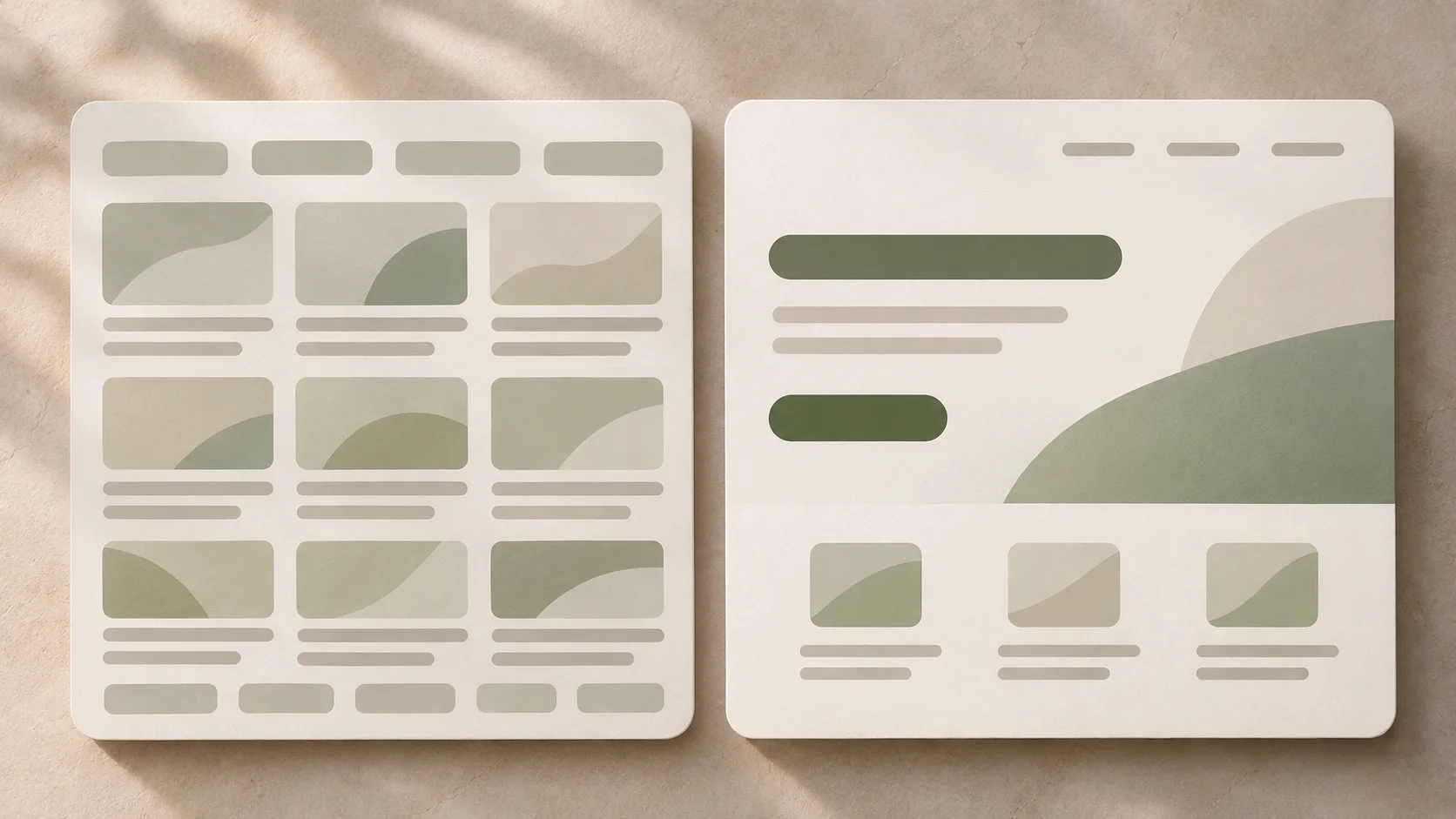
Elements placed close together appear related. Put a module title near its description, and leave a larger break before the next module. Space around a primary action can make it noticeable without adding another colour or border. Consistent gaps also give repeated sections a predictable rhythm.
The image above shows the difference in emphasis: a crowded set of equally weighted blocks asks the viewer to search, while a clearer layout establishes a first stop and lets supporting items follow. This is a useful check when reviewing a wireframe before visual styling.
05 Place the next step where it makes sense
Position affects what people notice, but there is no universal spot that solves every screen. Put the most useful information where the layout naturally begins and place an action near the context needed to choose it. On a course page, an enquiry button beside a concise course summary can work; a second opportunity after the curriculum can help someone who needed more detail first.
Avoid using repeated calls to action as a substitute for a clear path. Each visible action should have an understandable label and an appropriate priority. If “View curriculum” and “Enquire now” are both useful, style them according to the decision the visitor is most likely ready to make at that point.
06 Test the hierarchy at a glance and in use
Shrink your screen to a thumbnail or step back from it. What draws your eye first? Is that what a visitor needs first? Then remove colour temporarily. If the structure disappears, revisit size, placement and spacing rather than relying entirely on the palette.
Check a phone layout separately. A desktop's side-by-side arrangement may become a long vertical sequence, and a prominent action may slip too far from its supporting information. Finally, ask someone unfamiliar with the page to find the curriculum and explain how they would enquire. Observe where they pause. A small usability test can expose a priority mismatch that a visual review misses.
07 Common visual hierarchy mistakes
- Everything is bold: reserve the strongest treatment for the main purpose or action.
- The action appears before enough context: give people the information they need to decide.
- Colour carries the entire structure: reinforce it with size, labels, placement and spacing.
- Cards fragment related content: group items by meaning, not simply by available space.
- Desktop is the only review: recheck the reading order when columns stack on mobile.
Visual hierarchy is a design decision about attention. Define the task, rank the content, make that ranking visible, then test whether people can follow it. Those steps connect the broader principles of good UI design to a screen someone can actually use.
Want to practise hierarchy across real interface projects? Explore Zolve Academy's Professional UI/UX Design & AI-Powered Workflow Program, review its curriculum, and use the course enquiry option to discuss your learning goals.
FAQ
Common questions about Visual Hierarchy in UI Design: How to Guide User Attention
A quick summary of the most common questions readers have about this topic.
Visual hierarchy is the order in which an interface draws attention to its elements. Designers use size, contrast, placement, spacing and grouping to make the most important information and actions easier to notice and understand.
It helps people find the information they need, understand relationships between elements and identify a sensible next action. When every element has equal emphasis, users have to work harder to decide where to look.
That depends on the user's task. Usually the main page purpose or decision needs the strongest emphasis, followed by the information required to act and then the primary action. Secondary details should remain available without competing for attention.
No. Colour can help, but hierarchy also depends on size, typography, position, whitespace and meaningful grouping. Relying on colour alone can make a screen harder to understand or use.
Look at the screen at a glance, reduce it to a small thumbnail and ask someone unfamiliar with it to identify the page purpose and next action. Then test a realistic task and observe where they pause or look first.