A website can look polished and still feel impossible to use. The problem is often not the colour, spacing or animation. It is that people cannot predict where information lives, what a label means or which path will take them to their goal.
Information architecture (IA) is the organisation, labelling and connection of content and features so people can find what they need, understand where they are and complete a task. It is the structural layer behind menus, categories, page hierarchies, filters, links and search.
This guide is for UX beginners, students and career switchers. You will learn what IA includes, how it differs from related UX artefacts and how to create and test a simple information architecture without mistaking a neat sitemap for evidence.
Information architecture at a glance
- Start with people and tasks: structure the product around what users need to find or do.
- Understand the content: inventory what exists, remove duplication and identify relationships.
- Design four connected systems: organisation, labels, navigation and search.
- Make the structure visible: use hierarchies, sitemaps and navigation models to discuss it.
- Test findability early: card sorting informs groupings; tree testing checks whether paths work.
- Maintain it: an IA must evolve as content, services and user needs change.
01 What does information architecture mean in UX?
Information architecture answers practical questions such as:
- What content and functions belong in this product?
- Which items are related, and how should they be grouped?
- What should each category, link or action be called?
- Which routes should be available from a particular place?
- How can someone tell where they are and where they can go next?
- What happens when browsing is not enough and the person searches?
The VA.gov Design System's IA guidance describes the goal in similarly practical terms: help people find what they need, understand their location in an experience and complete intended tasks. That makes IA part of the user experience, not an internal filing exercise.
Imagine an education website containing courses, fees, schedules, outcomes, student work and enquiry options. The organisation could follow the institution's departments, but prospective learners may think in different terms: the skill they want, their current level, the time they can commit and the outcome they hope to reach. Good IA reconciles the content, the organisation's constraints and the user's mental model.
02 The four systems behind a clear information architecture
IA is easier to understand when you separate it into four connected systems. A weakness in one can make the others harder to use.
Organisation systems
Organisation defines how information is grouped and ordered. A course catalogue might use topic, skill level, format or career outcome. An account area might use tasks such as payments, profile details and support.
Some schemes are exact, such as alphabetical order or date. Others are ambiguous, such as topic or audience, and need more user research because different people may group the same item differently. The right scheme depends on the content and the task—not on which hierarchy looks most balanced.
Labelling systems
Labels are the words and short phrases that represent categories, links and actions. “Programs,” “Learning paths” and “Courses” might point to similar content but create different expectations.
Effective labels are specific, familiar and consistent. They help a person predict what will happen before selecting an option. Internal team language, acronyms and clever phrases often fail because users do not share the same context.
Navigation systems
Navigation exposes routes through the structure. It includes global menus, local navigation, breadcrumbs, related links, filters and contextual calls to action. Each element should help with at least one question: Where am I? What is nearby? Where can I go next? How do I return?
Navigation should not expose every possible destination at once. It should prioritise the choices that matter in the current context and use progressive disclosure for deeper detail.
Search systems
Search supports people who know what they want, cannot find a suitable browse path or use different vocabulary from the navigation. A search system includes more than an input field: indexing, synonyms, filters, result ranking, result labels, empty states and recovery all affect whether it works.
Search does not repair a confusing architecture by itself. Search results still need understandable titles, categories and relationships. Search queries can, however, reveal the terms people use and the content they expect to find.
03 IA is more than a sitemap
A sitemap is a diagram or list that shows pages and their parent-child relationships. It is a useful output because a team can inspect breadth, depth and gaps. But it is not the whole information architecture.
A sitemap may not show:
- why content was grouped in a particular way;
- which user tasks or evidence informed the hierarchy;
- how labels were chosen and where synonyms apply;
- cross-links between related areas;
- filtering, sorting or search behaviour;
- permissions, personalised states or conditional content; or
- how the structure behaves across channels and screen sizes.
Treat the sitemap as a model of part of the architecture. Keep the supporting decisions, content rules, navigation model and research findings with it so the team understands the reasoning rather than copying a tree blindly.
04 Information architecture, navigation and user flows
These concepts overlap, but they answer different questions.
- Information architecture: How are the product's information, features and destinations structured and named?
- Navigation: Which parts of that structure can a person move through from the current interface, and how are those choices presented?
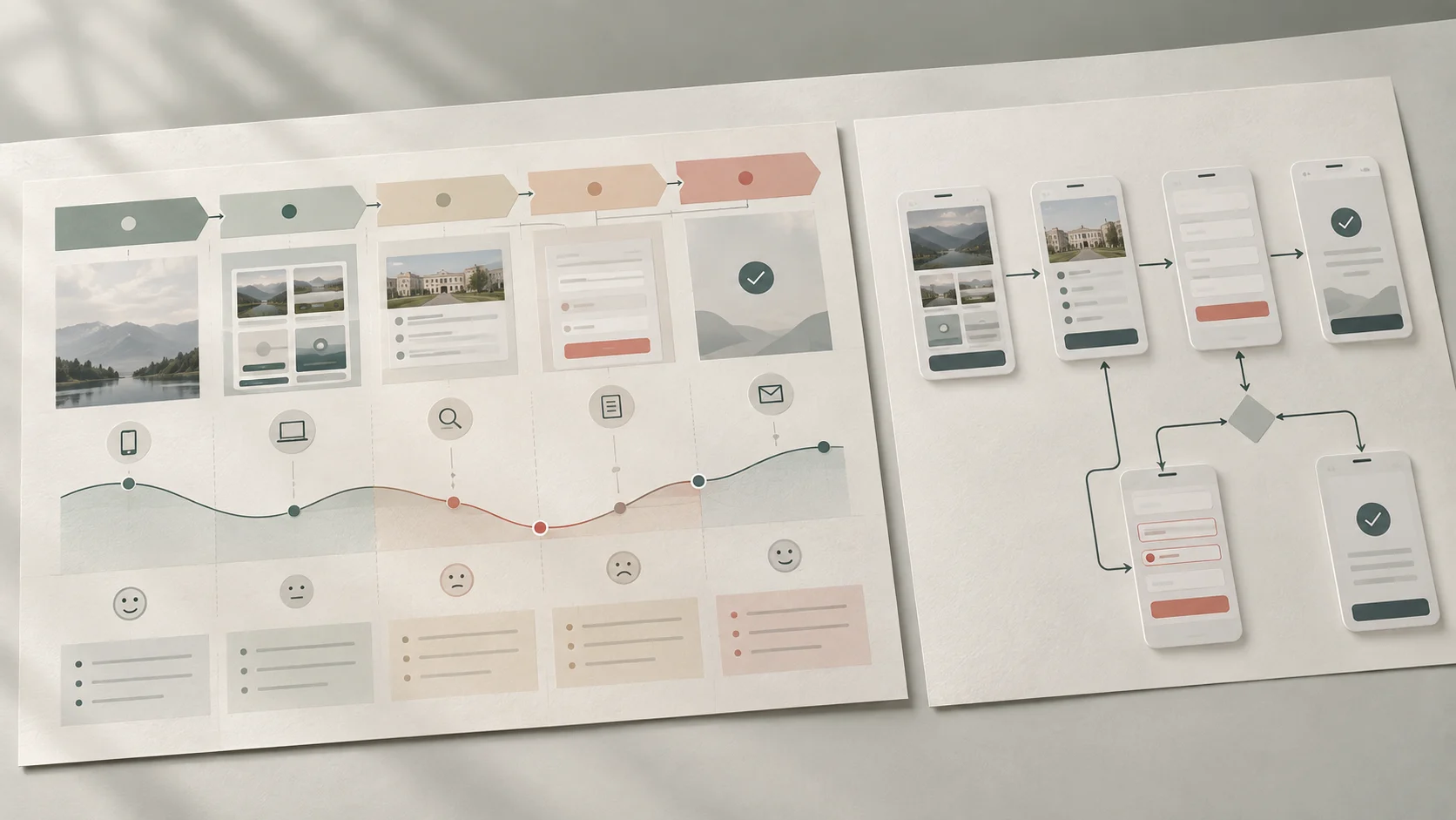
- User flow: Which steps, decisions and system responses occur as a person completes one defined task?
- Wireframe: How might content, navigation and controls be arranged on a particular screen?
A learner's flow from “compare courses” to “submit an enquiry” may pass through several parts of the architecture. If course details are grouped inconsistently or the enquiry link is labelled ambiguously, the flow breaks even when each individual screen looks attractive. Read our guide to user journeys and user flows for a closer look at task-level paths.
05 A practical process for creating information architecture
IA is not a single workshop. It is a sequence of learning, modelling and testing that becomes more detailed as the team understands the problem.
Step 1: define the users, tasks and scope
Identify who the product serves, what they need to find or accomplish and which part of the experience you are designing. Use research rather than relying only on stakeholder opinion. Interviews, support conversations, search terms, analytics and task analysis can expose vocabulary, priorities and recurring breakdowns.
For a new project with limited evidence, state assumptions explicitly and plan how to test them. Our beginner guide to UX research methods and process explains how different methods answer different questions.
Step 2: inventory and audit the content
List existing pages, documents, functions and important content objects. Record what each item is for, who owns it, whether it is current, how it is found and whether it duplicates something else.
An inventory tells you what exists. An audit adds judgment: keep, update, combine, move or remove. Without this step, teams often design a clean top-level navigation while leaving contradictory and duplicated content underneath.
Step 3: identify relationships and possible schemes
Look for recurring subjects, tasks, audiences, stages and content types. Sketch more than one grouping model. A task-based scheme may work for a service, while a topic-based scheme may suit a learning library. A hybrid can be appropriate, but each dimension should be clear enough that users can predict where an item belongs.
Step 4: draft the hierarchy and labels
Create a low-fidelity hierarchy before designing screens. Keep categories distinct, avoid unnecessary depth and use labels that describe the destination rather than the organisation's internal ownership. Note items that could reasonably appear in more than one place; cross-links or alternate entry points may be useful.
Step 5: design navigation and search together
Decide which destinations need global visibility, which belong within a section and which should appear only in context. Consider breadcrumbs, related content, filters and search behaviour. Check how the same structure will be exposed on a narrow screen without hiding essential orientation cues.
Step 6: test, revise and document
Test the structure before investing in visual polish. Record the evidence, decisions, naming rules and unresolved questions. After launch, monitor search queries, failed searches, support requests and task behaviour so the architecture can evolve with the service.
06 Card sorting and tree testing: related, but different
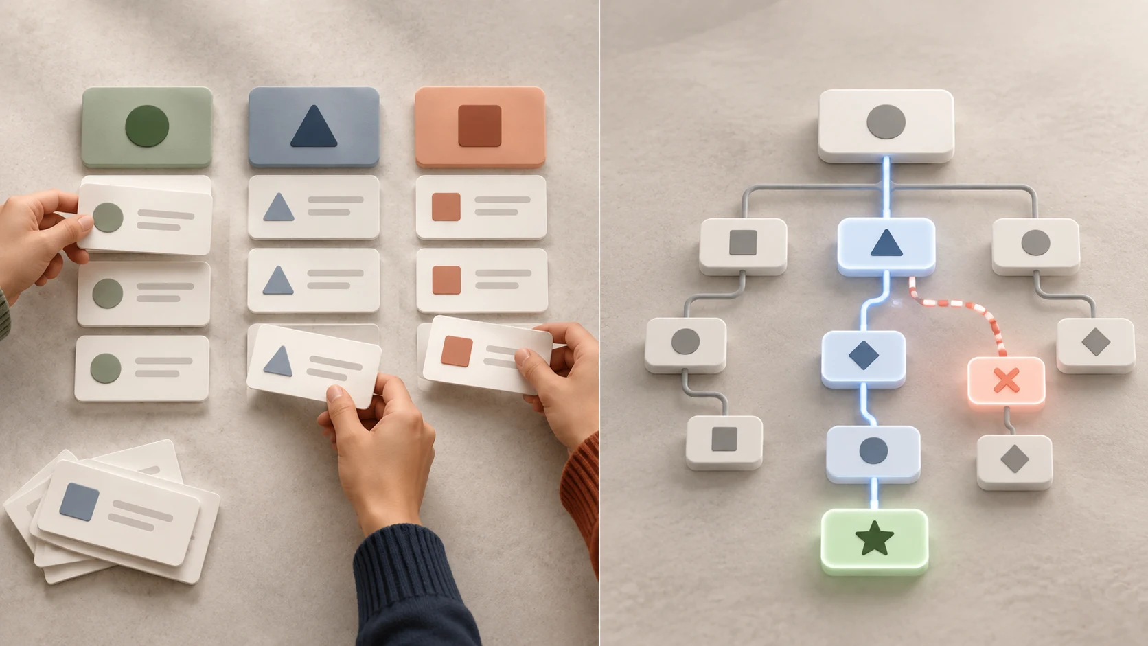
Card sorting helps you explore how participants group and name content. Tree testing checks whether people can find destinations in a proposed hierarchy without visual design influencing them.
Use card sorting to learn about mental models
In an open card sort, participants create and name groups. In a closed card sort, they place items into categories you provide. A hybrid combines both approaches. The patterns can reveal shared expectations, unclear items and vocabulary worth investigating.
Card-sort results do not automatically become the navigation. Participants may interpret cards differently, important business rules may be missing and the study sample may not represent every audience. Use the results as evidence alongside content and organisational constraints.
Use tree testing to evaluate findability
In a tree test, a participant receives a task and selects through a text-only hierarchy to show where they expect the answer to be. The team can observe direct success, indirect routes, backtracking and common wrong destinations.
Run it early enough to change the structure. If people repeatedly choose the wrong branch, investigate whether the label, grouping, task wording or content relationship is responsible. Then revise and test again rather than explaining the intended answer to the user.
07 Example: finding the right design course

Consider a prospective learner who wants practical UI/UX training but does not yet know a course name. Their questions may include: Is this suitable for beginners? What will I learn? How is the course delivered? Can I compare it with another path? What should I do next?
An organisation-centred structure might separate information by internal teams: academics, admissions, scheduling and student support. That makes sense to staff but forces the learner to assemble one decision across several unfamiliar areas.
A learner-centred architecture could instead provide:
- a clear entry point for courses or learning paths;
- consistent categories based on skills or outcomes;
- comparable course-detail structures for curriculum, suitability and delivery;
- related options where a learner may reasonably need them;
- persistent orientation through headings and breadcrumbs; and
- a clearly labelled enquiry action with an understandable next step.
The exact solution should come from research and testing, not this example. Its purpose is to show that IA shapes the whole decision journey. Zolve Academy's Professional UI/UX Design & AI-Powered Workflow Program page is a relevant destination for learners who want to inspect one practical course path and its curriculum.
08 Common information architecture mistakes
- Mirroring the organisation chart: internal departments rarely match the way users describe a goal.
- Designing the menu before understanding the content: navigation cannot represent relationships the team has not examined.
- Using vague or overlapping labels: options such as “Resources,” “Solutions” and “Explore” give weak clues when their contents overlap.
- Assuming fewer clicks always means better IA: a shallow menu with too many choices can be harder than a deeper but predictable path.
- Forcing every item into one place: people may approach the same content through different tasks, topics or stages.
- Treating search as a rescue feature: weak titles, metadata and content relationships also weaken search results.
- Testing only the polished interface: visual cues can hide structural problems that a tree test would reveal.
- Publishing and forgetting: new content, changing terminology and outdated ownership gradually damage findability.
09 A beginner exercise: structure a small learning library
Practise with 25 to 40 fictional learning resources rather than an entire large website. Include course pages, tutorials, FAQs, schedule information, project examples and enquiry guidance.
- Write three realistic user tasks before creating categories.
- List each content item on a separate card.
- Create two different grouping schemes and explain the trade-offs.
- Ask a few relevant participants to sort the cards and describe their reasoning.
- Draft a hierarchy using evidence from the sessions, not majority voting alone.
- Write specific labels and remove categories that overlap without a clear reason.
- Run a simple tree test with tasks that have one intended destination.
- Revise the hierarchy and document what changed and why.
Present the initial model, evidence, problems and revised structure together. That demonstrates UX reasoning more clearly than showing a final sitemap without context.
10 Good IA makes the next step feel obvious
Information architecture is successful when people do not need to learn the organisation behind the product. They can recognise a useful label, follow a predictable route, understand their location and recover when their first choice is wrong.
For a beginner, the most important habit is to separate structure from appearance. Understand the users and content first. Model the relationships. Choose labels deliberately. Test the hierarchy without visual decoration. Then let navigation and interface design express that evidence-based structure.
Want to practise research, information architecture, user flows, interface design and prototyping as one connected workflow? Explore Zolve Academy's Professional UI/UX Design & AI-Powered Workflow Program, review the curriculum and use the course enquiry option to discuss your goals.
FAQ
Common questions about What Is Information Architecture in UX Design?
A quick summary of the most common questions readers have about this topic.
Information architecture is the way content and features are organised, named and connected so people can find what they need, understand where they are and complete a task. It shapes categories, labels, hierarchy, navigation and search before visual styling is added.
The main parts are organisation systems, labelling systems, navigation systems and search systems. They work together: categories create order, labels explain choices, navigation exposes paths and search provides another way to find information.
No. A sitemap is one representation of pages and their relationships. Information architecture is the broader reasoning behind how content and functions are grouped, labelled, navigated and found, including rules that a sitemap may not show.
Information architecture describes how the product's information and destinations are structured. A user flow maps the steps, decisions and system responses involved in completing a specific task. A flow moves through the architecture, so the two should support each other.
Designers can use card sorting to learn how people group and name content, then use tree testing to see whether people can find destinations in a text-only hierarchy. Search logs, support questions, analytics and usability testing can reveal further problems after launch.