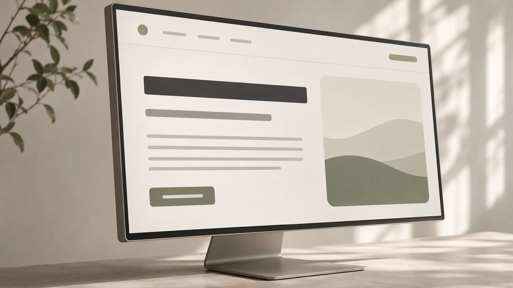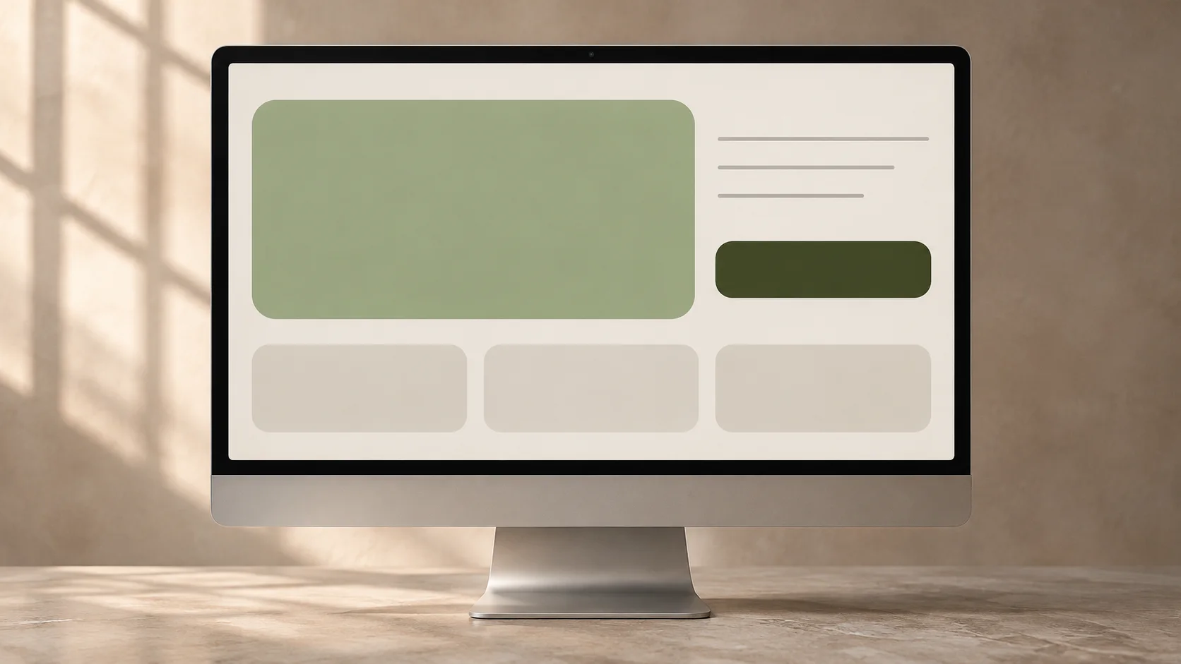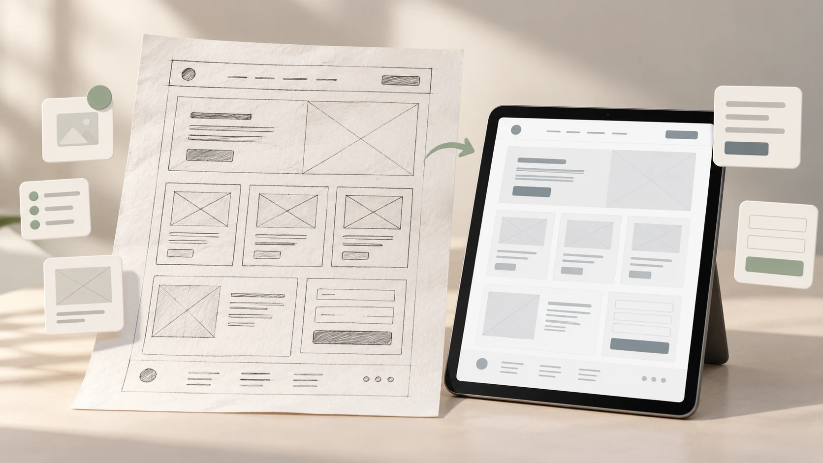
A wireframe can look simple, but that simplicity is deliberate. It lets a team debate what belongs on a screen, what matters most and how a person moves forward before colour, imagery and polished components make the design feel more settled than it really is.
A wireframe is a simplified representation of a digital interface that defines content hierarchy, layout, navigation, controls and important states. It is a thinking and communication tool, not a grayscale version of the final screen.
This beginner's guide is for UX students, career switchers and early-stage designers who want to understand what wireframes are, what to include, and when to use low-fidelity or high-fidelity wireframes.
Wireframes at a glance
- Purpose: make structure, priority and interaction decisions visible.
- Low fidelity: explore broad ideas quickly and cheaply.
- High fidelity: resolve detailed layout, content and behaviour questions.
- Content: use realistic labels and representative information when they affect the design.
- Scope: include the critical path, important alternatives and failure states.
- Outcome: create a clearer basis for prototyping, testing and visual design.
01 What does a wireframe actually show?
A wireframe turns an abstract requirement or user flow into a visible arrangement. It shows where information and actions might live, how they are grouped and which elements should attract attention first. A website wireframe may include navigation, headings, content regions, cards, forms and calls to action. An app wireframe may also show tabs, lists, controls, system feedback and navigation between states.
A useful wireframe can communicate:
- the purpose of the screen and the task it supports;
- the order and relative importance of content;
- the location of navigation, actions and input controls;
- relationships between sections, screens and states;
- expected content lengths and data requirements;
- responsive changes across relevant screen sizes; and
- empty, loading, error, success and permission states where they matter.
It does not need final colours, type styles, photography, illustration or perfect spacing. Those details can be added later when the team has enough confidence in the underlying structure.
02 Why wireframes are useful in the UX design process
Wireframes sit between understanding the problem and committing to a detailed solution. Research, requirements, information architecture and user flows provide inputs. The wireframe makes those inputs concrete enough to inspect.
Imagine a learner trying to compare courses. A flow can show that they move from a course list to details, comparison and enquiry. A wireframe has to answer more specific questions: Which facts appear on each course card? Is comparison an action or a separate page? What does an unavailable schedule look like? Can the learner understand the next step without reading every section?
Because the design is still inexpensive to change, a team can:
- compare several structures before refining one;
- spot missing content, unclear actions and unrealistic requirements;
- involve writers, developers and stakeholders in decisions earlier;
- discuss trade-offs without debating surface-level style; and
- create something concrete enough for an early review or usability study.
Wireframing is one part of the wider UX design process. It should reflect evidence and a clear user need, not become an excuse to start drawing screens before the problem is understood.
03 The basic anatomy of a useful wireframe
There is no universal wireframe template. A useful wireframe includes the information needed to evaluate the current design question and leaves out detail that would slow the discussion without improving it.
Content hierarchy
Show what the screen is about, which information is primary and what can be secondary or progressive. Relative size, position, grouping and order should make that hierarchy visible even without finished typography.
Navigation and orientation
Include the controls people use to understand where they are and where they can go. Global navigation, back behaviour, tabs, breadcrumbs or a step indicator may be relevant, depending on the experience.
Actions and inputs
Buttons, links, fields, filters and selectors should have meaningful labels. “Submit” says less than “Request course details.” The label is part of the interaction, not decoration to add later.
System response
A screen rarely stays in one ideal state. Show what happens while content loads, when a form is invalid, when no results match and after an action succeeds. These states often reveal more about the quality of a design than its default view.
Annotations when the screen is not enough
Add concise notes for behaviour that cannot be inferred from a still frame, such as what triggers a panel, which element remains fixed, where data comes from or what changes at a breakpoint. Explain intent and rules rather than narrating every visible rectangle.
04 Low-fidelity wireframes: fast structure and exploration
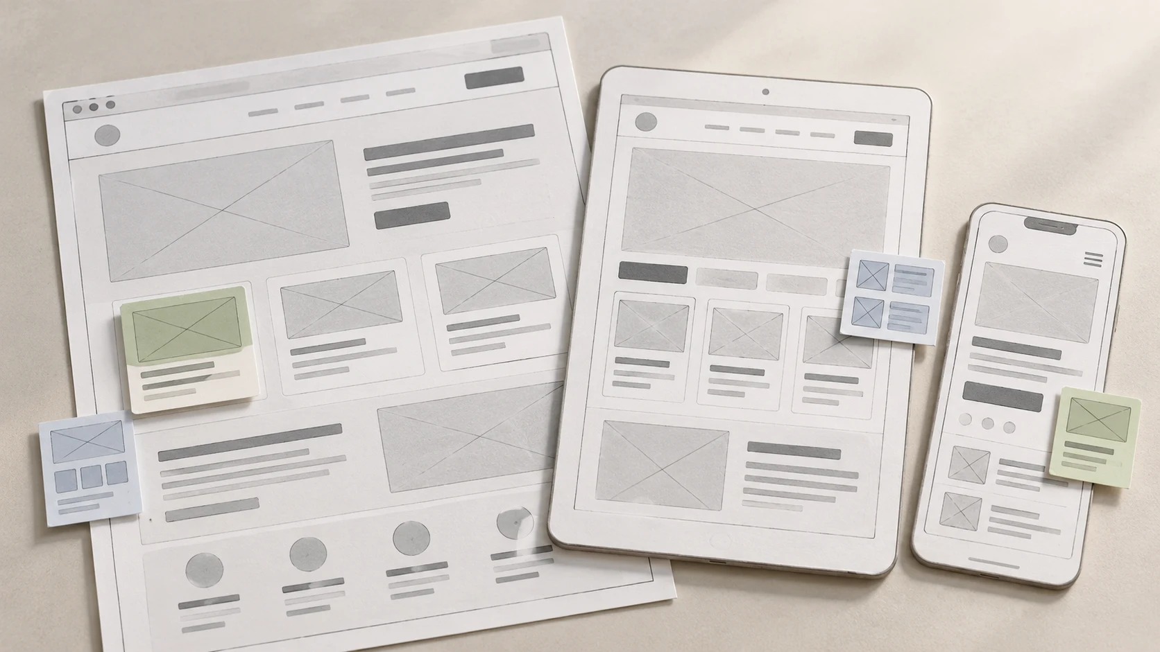
A low-fidelity wireframe is a rough representation used to explore layout, priority and flow without committing to detailed presentation. It may be drawn on paper or assembled digitally with simple grayscale shapes. Precision is intentionally limited.
Use low fidelity when you need to:
- generate and compare multiple approaches;
- align the team on the purpose of a page or screen;
- check whether a flow has the necessary steps and information;
- review an early concept before investing in components; or
- test broad terminology, sequence or task comprehension.
Low fidelity should still be understandable. Rough does not mean vague. Identify the screen, label important actions, show meaningful content groups and make the intended sequence clear. If every rectangle is anonymous, reviewers will fill the gaps with different assumptions.
05 High-fidelity wireframes: detailed structure without final styling
A high-fidelity wireframe describes structure and behaviour with greater precision. It may use an accurate grid, representative content, defined component states, realistic spacing and clearer responsive rules. It still does not need the final visual identity.
High-fidelity wireframes are useful when:
- content length and density affect whether the layout works;
- a complex form, dashboard or transaction needs detailed states;
- the team must agree on responsive behaviour and reusable patterns;
- developers need clearer interaction rules before estimation; or
- a test requires more realism than a rough sketch can provide.
The extra detail should answer a question. If a designer spends time perfecting alignment, icons and shadows before the team has agreed on the task and content, fidelity has increased without reducing the important uncertainty.
06 Low fidelity vs high fidelity: how to choose
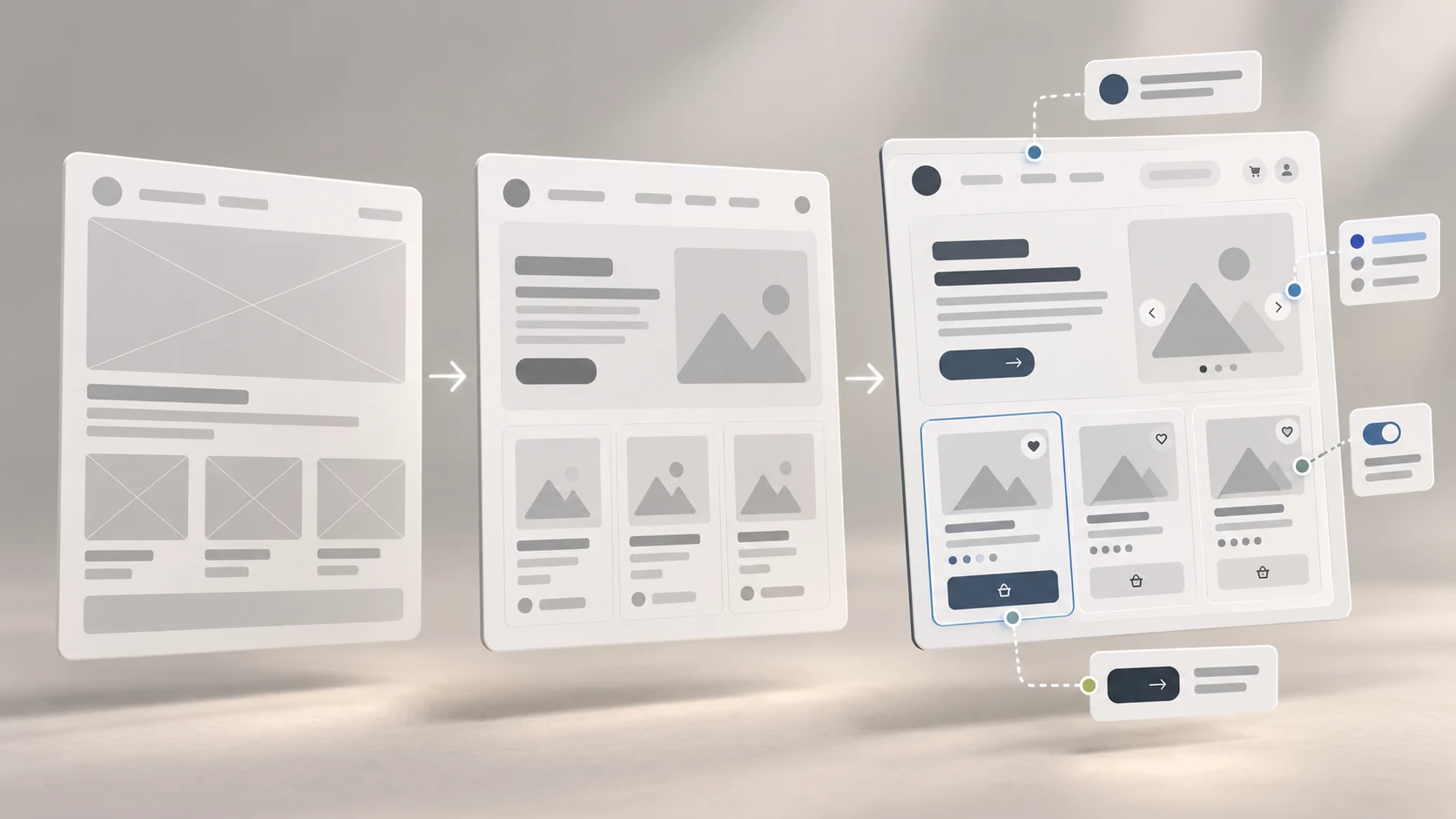
Fidelity is not a badge of quality. It is the amount of realism and precision needed to support the next decision. A low-fidelity wireframe can be excellent if it helps a team reject a weak structure in ten minutes. A detailed wireframe can be wasteful if the underlying idea has not been examined.
- Choose low fidelity for breadth, speed, early critique and structural alternatives.
- Choose high fidelity for depth, realistic content, complex states and implementation detail.
- Move between them deliberately: increase fidelity only when added realism is necessary to answer the next question.
You do not have to progress every screen through the same stages. A familiar confirmation page may remain rough while a risky comparison tool receives detailed states. Match the effort to uncertainty, consequence and complexity.
07 How to create a wireframe step by step
- Define the question. Write the user, task, context and decision the wireframe should support.
- Gather the inputs. Review relevant research, requirements, content, constraints, information structure and the user flow.
- List the necessary content and actions. Separate what users must see or do from what is merely desirable.
- Sketch several structures. Change grouping, sequence, emphasis and navigation rather than producing three cosmetic variations of one idea.
- Select a direction with reasons. Compare the options against the user need, evidence, accessibility, business goal and technical constraints.
- Add representative content. Use plausible headings, labels, data lengths, instructions and errors.
- Cover important states and sizes. Include alternative paths, failures and responsive changes relevant to the task.
- Review or test the wireframe. Observe how people interpret it, record issues and revise before adding unnecessary polish.
Keep the original question beside the work. It is easy for a wireframing session to drift into designing everything the product might eventually contain.
08 Use realistic content, responsive thinking and accessibility early
Wireframes are often called “content agnostic,” but content and structure shape each other. A card designed around two neat placeholder lines may fail when course names vary in length. A form may appear simple until instructions, optional fields, validation and privacy context are included.
Use representative content to test:
- whether headings and labels make sense without explanation;
- how long or missing values affect the layout;
- what information people need before taking an action;
- whether error messages help someone recover; and
- which details can be progressively disclosed rather than shown at once.
Think beyond one desktop frame. Decide what retains priority on a narrow screen, how navigation changes, whether a comparison remains usable and what happens when content wraps. A desktop wireframe scaled down to mobile is not a responsive design.
Accessibility also begins before visual styling. Use logical reading order, descriptive labels, clear grouping, predictable focus movement and controls with understandable purposes. Do not rely on colour alone to express meaning, even in an early wireframe. Later visual design must still address contrast, type size and touch targets, but a clear structure gives that work a stronger foundation.
09 Paper, whiteboard or Figma: choose the lightest useful tool
Paper encourages speed and makes attachment to an idea less likely. A whiteboard helps a group explore a flow together. Digital tools make revision, duplication, components, responsive layouts and remote feedback easier.
Choose the tool based on the work:
- use paper for individual exploration and rapid alternatives;
- use a whiteboard for collaborative structure and flow discussions;
- use Figma or another interface tool for reusable elements, consistent revisions and shared review; and
- use an interactive format only when interaction is necessary to answer the question.
A component library can speed up wireframing, but do not let its available patterns decide the solution. Components should support thinking, not narrow it before alternatives have been considered.
10 How to review and test a wireframe
A productive review starts with context. Explain the intended user, task, evidence, constraints and fidelity. Then ask questions tied to decisions rather than “What do you think?”
- What does this screen appear to help someone do?
- Which information seems most important, and is that intentional?
- What would you expect to happen after this action?
- Which content, state or path is missing?
- Where might the structure fail on a smaller screen or with longer content?
- Which assumption creates the greatest risk if it is wrong?
For a usability session, connect only the screens and states required for a realistic task. Tell participants that the design is unfinished, then observe what they try to do. A rough appearance does not make poor task wording or leading facilitation acceptable. Record behaviour, confusion and successful recovery, then revise the structure rather than defending it.
11 Common wireframing mistakes
- Starting before defining the problem: a screen cannot compensate for an unclear audience or outcome.
- Designing only one option: refinement begins too early and the first familiar pattern becomes the answer.
- Using placeholder content everywhere: repeated gray lines hide real hierarchy, comprehension and length problems.
- Ignoring states: only the ideal screen is shown, while loading, empty, error and success experiences remain unresolved.
- Adding polish too soon: visual detail consumes time and makes weak ideas feel harder to change.
- Making every screen equally detailed: effort is spread across low-risk areas instead of the uncertain part of the experience.
- Treating mobile as a smaller desktop: priority, navigation and interaction are not reconsidered for limited space.
- Reviewing without context: feedback becomes personal preference because the user, task and decision are unclear.
- Annotating everything: excessive notes make the artefact harder to scan and often repeat what is already visible.
12 A beginner wireframing exercise
Design a small course-comparison flow for a fictional learning platform. The goal is to help a first-time visitor compare two options and request relevant details.
- Write the user's goal, key decision and known constraints.
- List the course details needed for comparison and enquiry.
- Sketch three different list or comparison structures on paper.
- Choose one direction and explain the trade-offs.
- Create low-fidelity wireframes for list, details, comparison, form error and confirmation states.
- Adapt the critical screens for a narrow mobile layout.
- Replace generic placeholders with representative course content.
- Ask someone to complete a realistic task and revise the structure based on what you observe.
When presenting the exercise, show the alternatives, the reason for your choice and what changed after review. That demonstrates more design judgement than a single polished screen. It also reflects what UI/UX designers actually do: connect user needs, content, interaction and constraints through visible decisions.
13 A wireframe is valuable when it improves the next decision
The purpose of a wireframe is not to produce a required deliverable or make progress look visible. It is to expose assumptions while change is still inexpensive. Good wireframes make hierarchy, content, actions and states clear enough for a team to question them.
Start with the problem, use the lowest fidelity that supports the decision, add realistic detail when it becomes necessary and keep testing the risky parts. The result is not merely a better wireframe. It is a stronger foundation for the prototype, visual design and implemented experience that follow.
Want to practise wireframing as part of a complete research-to-prototype workflow? Explore Zolve Academy's Professional UI/UX Design & AI-Powered Workflow Program, review the curriculum and use the course enquiry option to discuss your starting point and project goals.
FAQ
Common questions about What Is a Wireframe? Low-Fidelity vs High-Fidelity Wireframes
A quick summary of the most common questions readers have about this topic.
A wireframe is a simplified representation of a digital interface that shows its content hierarchy, layout, navigation, controls and important states before the final visual design is developed. It helps a team discuss how an experience should work without being distracted by polished colours, imagery or styling.
Low-fidelity wireframes use rough shapes and limited detail to explore structure, flow and alternative ideas quickly. High-fidelity wireframes use more precise layout, realistic content, component behaviour and important states to resolve detailed questions. High fidelity does not necessarily mean a finished visual design or working prototype.
No. A wireframe describes the structure and priority of an interface. A prototype simulates interaction so someone can move through a task or experience states and transitions. Wireframes can be connected to create a low-fidelity prototype, but the terms describe different qualities.
Use realistic content as early as practical, especially for headings, labels, calls to action, form guidance, errors and information people compare. Placeholder text can hide content-length, comprehension and hierarchy problems. The content does not need to be final, but it should be representative.
No. Paper, a whiteboard or another design tool can be enough for early exploration. Figma becomes useful when a team needs reusable components, consistent revisions, responsive layouts, comments, sharing or clickable flows. Choose the lightest tool that can answer the current design question.