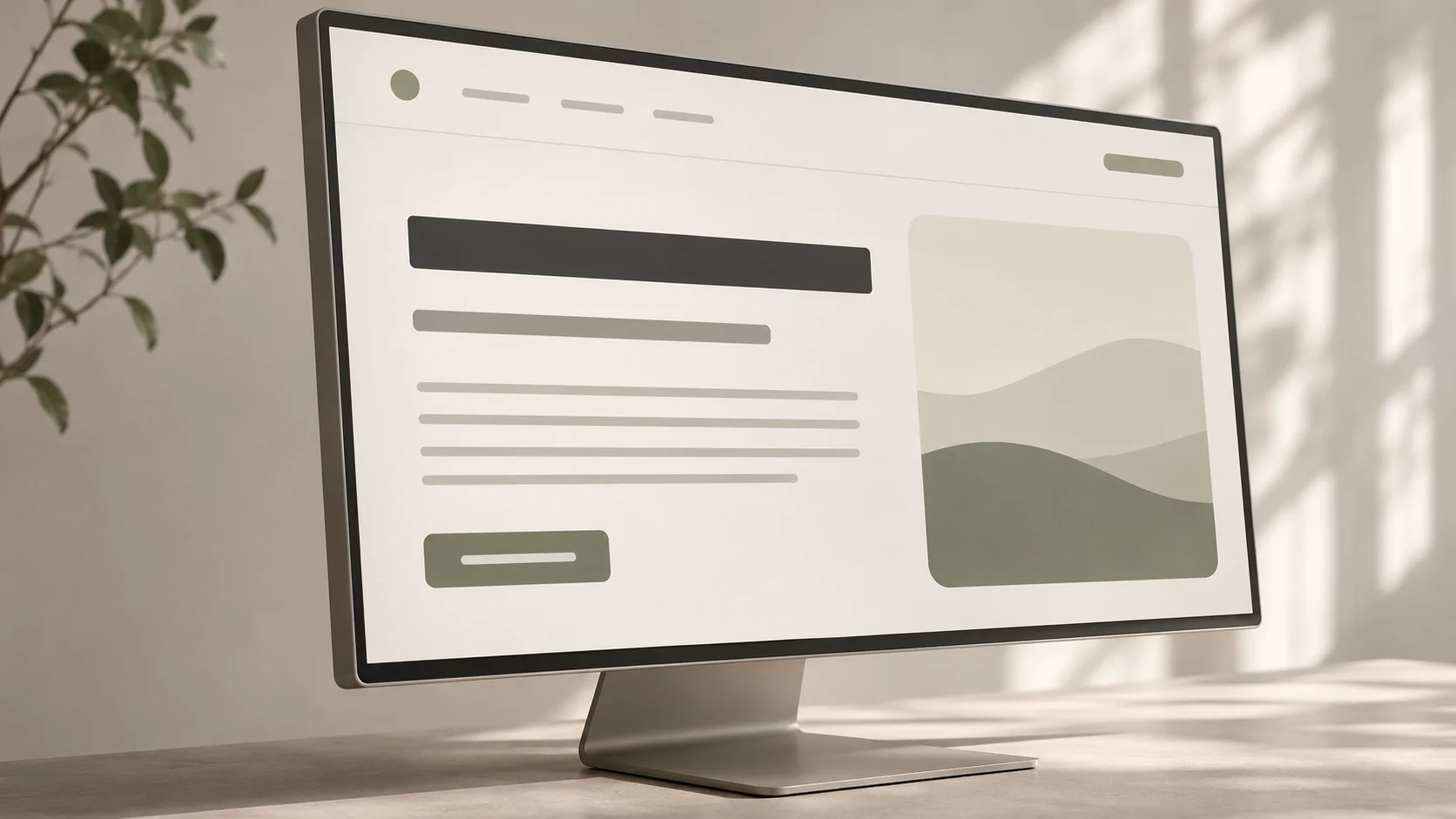
A screen can have the right content and still be hard to use if its text is difficult to scan, read or act on.
Typography in UI design is the system of type choices that makes interface text readable and gives it a clear order. It covers typeface, size, weight, line spacing, line length and the space around text. For students and career switchers designing their first websites or apps, the goal is not to find the most distinctive font. It is to help someone understand a screen and complete a task.
Imagine a course detail page. A visitor wants to know what they will learn, how the program works and where to enquire. The typography should make the program name easy to find, the details comfortable to read and the next step obvious. We will use that page as a running example.
A practical typography check
- Can someone tell the page title from a section heading at a glance?
- Is the body copy comfortable to read at its actual display size?
- Are line length, spacing and contrast helping the reader stay oriented?
- Do buttons, form labels and error messages remain clear on mobile?
- Does the layout still work when text grows or wraps?
01 Start with the reader's task
Before choosing a typeface, list the text a visitor must find. On the course page that could be the course name, a short description, learning outcomes, delivery details and an enquiry action. Give each a role. The name is a page title; learning outcomes are section content; the enquiry control needs an action label. This is the same priority work behind visual hierarchy in UI design.
If everything is styled as a heading, the reader has to reconstruct the structure. If every detail is small and quiet, they may miss information needed to decide. Good typography makes the structure visible without forcing attention.
02 Choose a typeface for the content and context
Start with a typeface that reads well in short labels and longer paragraphs. Inspect the actual letterforms, not just a polished specimen headline. Are similar characters easy to distinguish? Are numbers legible in dates and course details? Does the family offer the weights you need without relying on fake bold styling?
One versatile family is enough for many beginner projects. If you combine two, assign each a consistent job, such as display headings and body text. Check that both remain readable on the devices you expect people to use. A decorative face that works in a poster may slow down a form or curriculum page.
03 Build a small type scale with named roles
A type scale is a set of reusable styles, not a list of arbitrary sizes. Create roles for page title, section heading, smaller heading, body copy, label and supporting text. For each, record size, weight and line height. You can adjust the values later, but the roles should remain stable across screens.
For a first web design, body text around 16px can be a sensible starting point. It is not a rule: a font with a small x-height may need more space, while a dense data interface has different constraints. Make the title clearly stronger than the body without turning every heading into a dramatic display element. Use weight and spacing alongside size. The course name might be prominent, while module titles are distinct but quieter.
04 Make paragraphs comfortable to read
Readability depends on more than font size. Long lines make it hard to find the start of the next line; very short lines interrupt the reading rhythm. Give paragraphs a reasonable maximum width and check them with real copy. Set line height so lines have room to breathe without drifting apart, then add enough space between paragraphs to show where one idea ends.
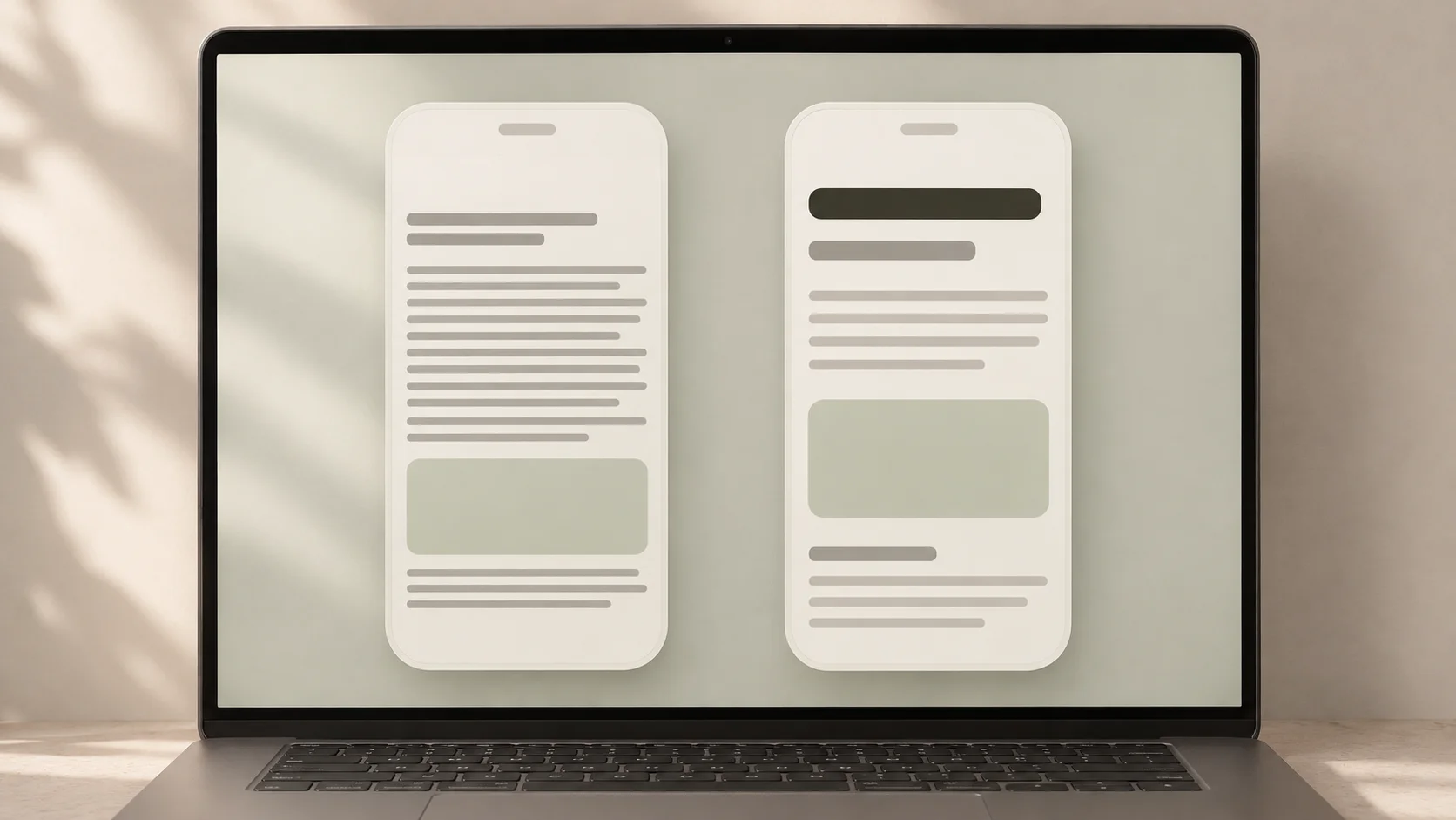
The comparison above is a useful reminder: the same information can feel crowded or manageable depending on its hierarchy and spacing. On the course page, a curriculum paragraph should be readable before the visitor reaches the enquiry action. Break long explanations into short paragraphs or meaningful lists when that helps the decision.
05 Give small interface text real attention
Buttons, navigation, field labels, helper text and errors are often the words people rely on most. Write labels that describe an action or destination. Keep essential instructions visible rather than hiding them in faint placeholder text. A form error should explain what needs fixing and remain legible when the page is zoomed.
Check text contrast against its background, especially for secondary copy. Muted does not have to mean barely visible. Test the design at real size rather than judging a zoomed design canvas. If a button label wraps on a narrow phone, allow room for it instead of forcing tiny text.
06 Test with real content and responsive layouts
Replace placeholder text early. A two-word sample heading will not reveal what happens when an actual course title wraps onto two lines. Add a long module name, a detailed error message and a short button label. Then check desktop and phone layouts, text zoom, and any languages or scripts the product needs to support.
Ask someone unfamiliar with the page to find a course outcome and explain how to enquire. Watch where they pause or reread. A small usability test can reveal whether the type system supports the task, not merely whether it looks polished.
07 Common typography mistakes
- Too many styles: reuse a few named text roles so similar content looks related.
- Small body copy to save space: edit or restructure content before making it harder to read.
- Weak contrast: keep secondary text quiet but legible.
- Overlong lines: constrain paragraph width and check reading comfort.
- Designing with placeholder copy: test actual labels, titles, errors and longer passages.
- Checking only one screen size: review wrapping, zoom and hierarchy on narrow screens.
A useful type system begins with the content people need, gives each kind of text a consistent role, and survives real reading conditions. It works alongside core UI design principles: hierarchy, consistency, contrast and clear feedback.
Want to practise typography as part of complete interface projects? Explore Zolve Academy's Professional UI/UX Design & AI-Powered Workflow Program, review the curriculum and use the course enquiry option to discuss your learning goals.
FAQ
Common questions about Typography in UI Design: A Practical Beginner's Guide
A quick summary of the most common questions readers have about this topic.
Typography in UI design is the way text is selected, sized, spaced and arranged in an interface. It helps people read content, understand its order and identify actions.
Start with one versatile typeface and a small set of weights. Add another typeface only when it has a clear role and remains readable across the interface.
A type scale is a set of reusable text styles for roles such as page titles, section headings, body copy, labels and captions. Each role has deliberate size, weight and line spacing.
No single size works everywhere. Around 16px is a useful web starting point, but the typeface, device, line length, user needs and viewing conditions should guide testing. Avoid shrinking essential text just to fit more on screen.
Review the interface at real phone and desktop sizes, test text zoom and long content, check text contrast, and ask someone to complete a realistic reading or decision task.