
A beautiful palette can still make an interface confusing if every button, warning and link competes for attention.
Colour in UI design works best as a system of roles, not a collection of favourite swatches. It helps people recognise actions, read content and understand feedback. For students and career switchers building their first app or website, a small, deliberate system is easier to apply and test than a large palette chosen screen by screen.
Imagine a course enquiry page with a primary enquiry button, course details and a form. The colours need to make the next step clear, keep information readable and distinguish a form error from a successful submission. This guide shows how to create that system and check whether it holds up in real use.
A quick colour system checklist
- Assign colours to interface roles before designing individual screens.
- Choose a restrained set of neutrals and one clear primary action colour.
- Check text and component contrast against their actual backgrounds.
- Give errors and success messages labels or icons as well as colour.
- Test hover, focus, disabled and dark mode states where they apply.
01 Start with meaning, then choose colours
Before opening a colour picker, list what the interface needs to communicate. A typical page needs a background, a surface for cards or forms, primary and secondary text, a primary action, borders and feedback states. These are semantic roles: names based on purpose rather than appearance.
For the course page, the enquiry button is the primary action. Its colour should be reserved for actions of similar importance. A muted panel can group course details, while an error colour appears only when a field needs attention. If the same bright colour is used for every heading, badge and button, the action loses its priority. This connects colour to visual hierarchy, not just brand expression.
02 Build a small palette with named roles
Begin with a light or dark canvas, a surface colour, strong and muted text colours, one primary action colour and a few border or divider values. Add warning, error and success colours only if the interface uses those states. A colour scale can provide lighter and darker values for hover or subtle backgrounds, but each value should have a job.
Name tokens by role, such as text-primary, surface-default and action-primary. Avoid names tied only to a hue, such as green-500, when the meaning needs to survive a redesign. In a design file, document where each role belongs and show it on a real button, input and content panel. That makes the palette reusable rather than a swatch board with no rules.
A brand colour may be too light for text on white or too dark for a button label on a dark surface. Keep the brand relationship, then adjust the actual interface values to support reading and action. A useful system can include different values for a brand accent, a filled action and a text link.
03 Check contrast in the real component
Contrast is the difference in relative luminance between foreground and background. Under WCAG 2.2's minimum text contrast guidance, normal text needs a ratio of at least 4.5:1 and large text at least 3:1 for Level AA, subject to the standard's exceptions. Do not judge this by eye alone. Test the exact text and background pair, including labels on buttons, links, placeholder-like helper text and messages.
Non-text visual information also matters. A form field boundary, focus indicator or icon may need enough contrast to be distinguished from surrounding colours. Check those separately from text. Contrast tools can flag a candidate pair, but review the finished screen at normal size and on more than one display. Thin type, small labels and textured backgrounds can make a technically passing pair harder to use.
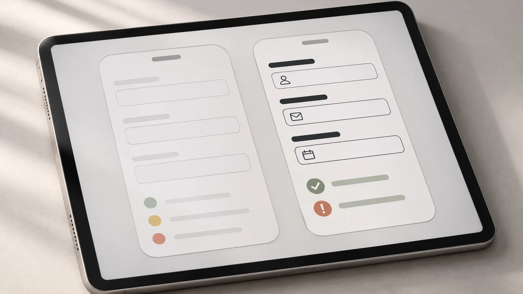
The right-hand example makes the form easier to scan because the labels and field boundaries are clearer, and the feedback has visible symbols. The lesson is practical: evaluate colour where it appears in the component, not as isolated squares on a palette.
04 Never make colour the only signal
A red border alone does not tell everyone why an enquiry form failed. Add a message such as “Enter a valid email address” near the field and connect it to the input in the implemented page. A green success banner should include a direct confirmation message. Charts and status lists need labels, shapes or patterns when colour differences carry information.
This follows the WCAG use-of-colour guidance. It also improves clarity for someone viewing a screen in glare, using a low-quality display or scanning quickly. A visible focus indicator should not disappear into the selected button colour.
05 Design states and themes as part of the system
A primary button has more than one appearance. Design its default, hover, pressed, keyboard focus and disabled states where relevant. Keep the label readable in each state. A disabled button may look subdued, but its purpose and availability should still be understandable in context. Do not use a disabled state to hide why a form cannot be submitted.
For dark mode, keep semantic names such as text-primary and surface-default, then assign values suited to darker surfaces. Do not simply invert the light palette. Bright accents can appear harsher against dark backgrounds, and subtle borders may disappear. Test real cards, forms, links and messages in both themes.
06 Test the system on a complete task
Apply the palette to a small but realistic flow: find the course information, open the enquiry form, make one validation error and complete the form. Look for inconsistencies. Does the same colour mean “primary action” on one screen and “warning” on another? Can a visitor find the button without every element shouting? Is the error clear before they try again?
Check the screens at phone and desktop sizes, with real content and different text lengths. Ask another person to explain which action they would take and what each message means. A short usability test can reveal whether the palette helps the task. Pair this review with readable UI typography; colour and text need to work together.
07 Common colour system mistakes
- Choosing colours before roles: define what each colour communicates first.
- Using too many accents: keep the main action visually distinct.
- Checking swatches instead of components: test the actual foreground and background combination.
- Relying on red and green alone: add labels, icons or another cue.
- Forgetting states: review focus, hover, error, success and disabled behaviour.
- Assuming dark mode is an inversion: assign and test its values separately.
A good colour system is small enough to remember, specific enough to apply and flexible enough to support real screens. Start with meaning, test accessibility in context and refine the palette when a component exposes a genuine gap.
Want to practise colour systems as part of complete interface projects? Explore Zolve Academy's Professional UI/UX Design & AI-Powered Workflow Program, review the curriculum and use the course enquiry option to discuss your goals.
FAQ
Common questions about Colour in UI Design: How to Build a Clear and Consistent Colour System
A quick summary of the most common questions readers have about this topic.
A UI colour system is a small set of named colour roles, such as text, background, primary action, border and error. The roles help teams use colour consistently across screens and states.
There is no fixed number. Begin with a restrained set of neutrals, one primary action colour and only the status colours the product needs. Add shades when a specific role or state requires them.
WCAG 2.2 Level AA calls for at least 4.5:1 contrast for normal text and 3:1 for large text, with defined exceptions. Check each text and background pair in its actual interface state.
No. Pair colour with a clear label, icon, pattern or other visual cue so people can understand the state without relying only on hue.
The same semantic roles can carry over, but their colour values usually need adjustment. Test contrast, visual hierarchy and component states separately on dark surfaces.