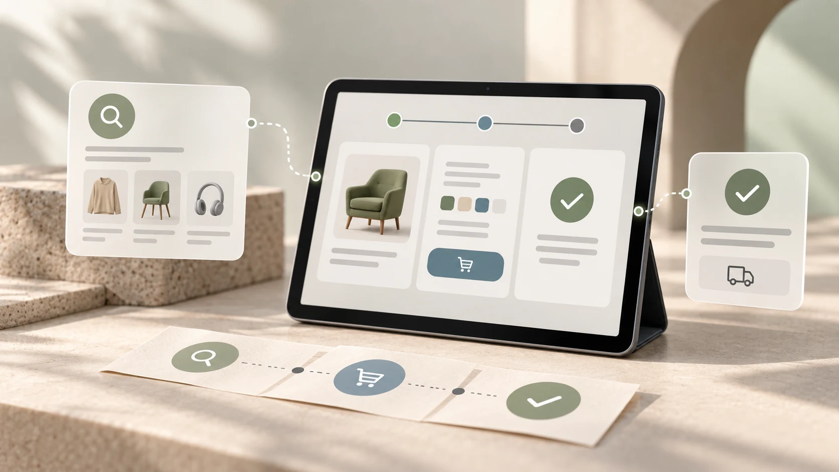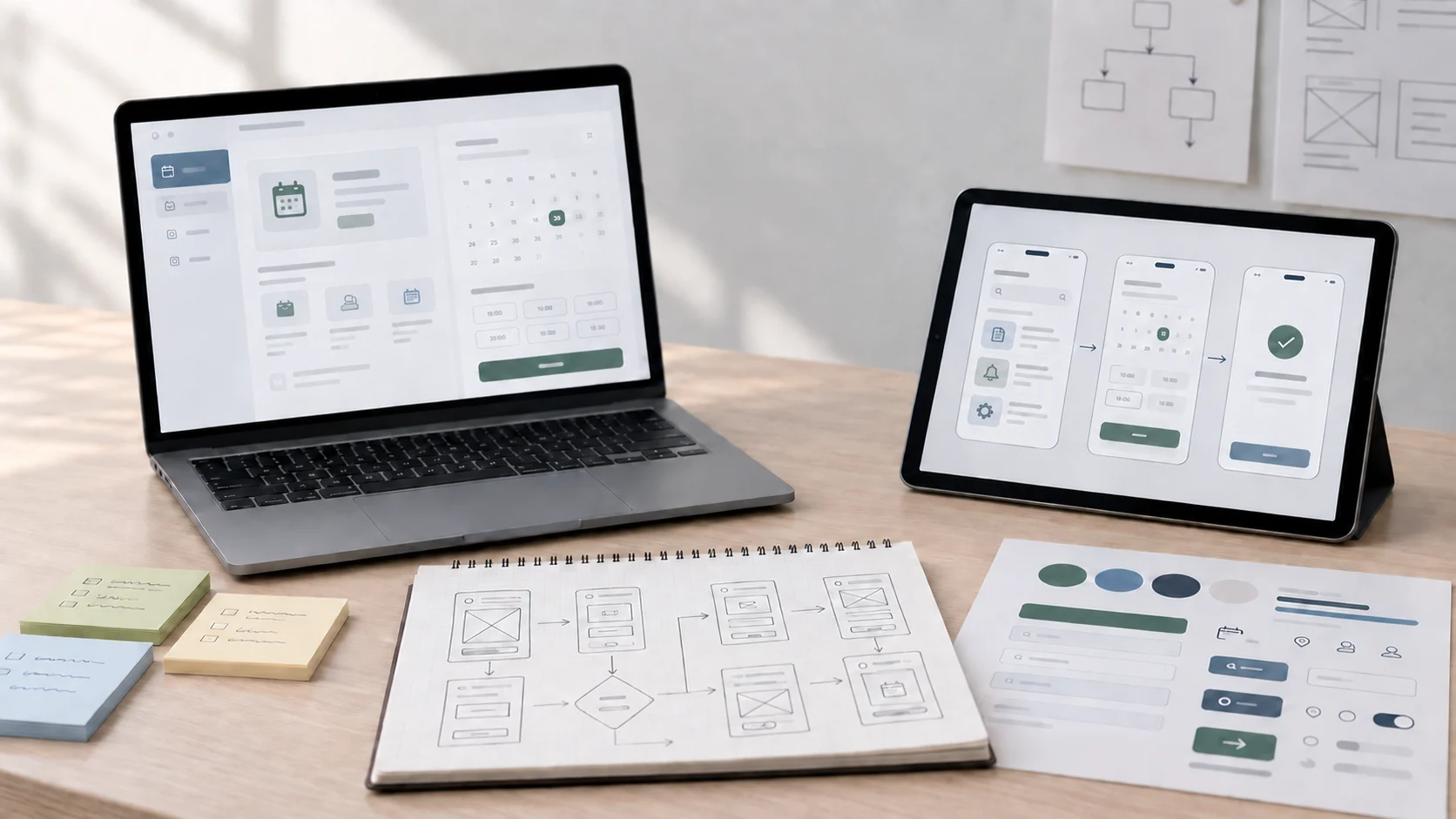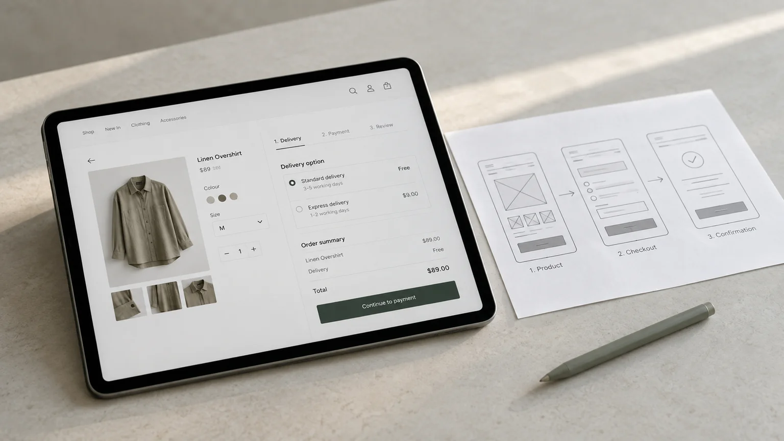
You find a shirt online, choose your size and reach checkout. The page looks polished, but delivery charges appear only after you enter your address. Is that a UI problem or a UX problem?
UI design shapes the interface people interact with. UX design considers the broader experience of achieving their goal. UI covers layout, controls, typography and feedback; UX considers what people need, how the task unfolds and where the product or service creates difficulty. UI is one contributor to UX, so the two overlap.
For students and career switchers, this distinction helps you learn the right skills and explain your design decisions. We will use a fictional clothing-store checkout to compare the work, show why both matter and give you a small exercise. For a wider introduction, start with our beginner's guide to UI/UX design.
UI vs UX at a glance
- UI question: Can someone read, recognise and operate this interface?
- UX question: Does the experience help that person accomplish the right task?
- UI example: Clearly distinguish an available size from a selected or sold-out size.
- UX example: Let shoppers understand delivery cost and timing before committing.
- Shared responsibility: Check whether the proposed design works for people in context.
01 What does UI design focus on?
User interface design focuses on the parts of a product that people operate and the information those parts communicate. For a website or app, that includes menus, fields, buttons, content hierarchy and the states shown after an action.
In our checkout, a UI designer might group the shirt name, chosen size and price so shoppers can review them quickly. They would also define how a discount field behaves when a code is invalid and how the page communicates that an order is being submitted.
- Hierarchy: Make the total and next action easy to find.
- Typography and spacing: Keep prices, labels and supporting details readable.
- Controls: Make size selectors, address fields and delivery options understandable.
- States: Show selected, unavailable, loading, error and success states.
- Consistency: Use familiar patterns across the product and adapt them to smaller screens.
A screen with elegant colours but unclear labels still has weak UI. Interface design involves behaviour and communication as well as visual appearance.
02 What does UX design focus on?
User experience design looks at the experience surrounding a person's goal. It asks who is using the service, what they are trying to accomplish, what information they need and what makes the task difficult. That experience can extend beyond the screen to delivery updates, support and returns.
For the clothing store, UX work could investigate whether shoppers need delivery estimates before checkout, why they change their selected size, or how they recover when an item becomes unavailable. The team needs evidence from relevant users and service constraints before choosing a solution.
UX work may produce research findings, an organised content structure, task flows, wireframes and test findings. These are tools for making decisions, rather than a checklist of documents every project must create.
For example, a task flow could reveal that the checkout forces account creation before showing the total. A designer would investigate whether that requirement serves a necessary purpose and explore alternatives with the team. Removing a step is useful only if the remaining experience still gives people what they need.
03 How UI and UX responsibilities differ
Use these pairs to compare the focus of a decision. They are practical tendencies, not fixed boundaries between job titles.
Understanding the problem
UX focus: Learn why shoppers hesitate and what they need to decide. UI focus: Examine whether the screen makes that information legible and easy to locate. Both may observe the same usability session.
Designing a solution
UX focus: Explore the order of steps and where to introduce delivery information. UI focus: Design the delivery selector, cost summary and feedback within those steps. A change in layout can also change how people understand the task.
Checking the result
UX focus: Check whether someone can complete the purchase with an accurate understanding of the cost. UI focus: Check whether controls, labels and states support that task on the relevant devices. Developers and accessibility specialists also contribute to the implemented experience.
One person may do both types of work. A larger team may include researchers, product designers and interface specialists. When comparing roles or courses, look at their actual responsibilities and learning outcomes.
04 Why a checkout needs both UI and UX
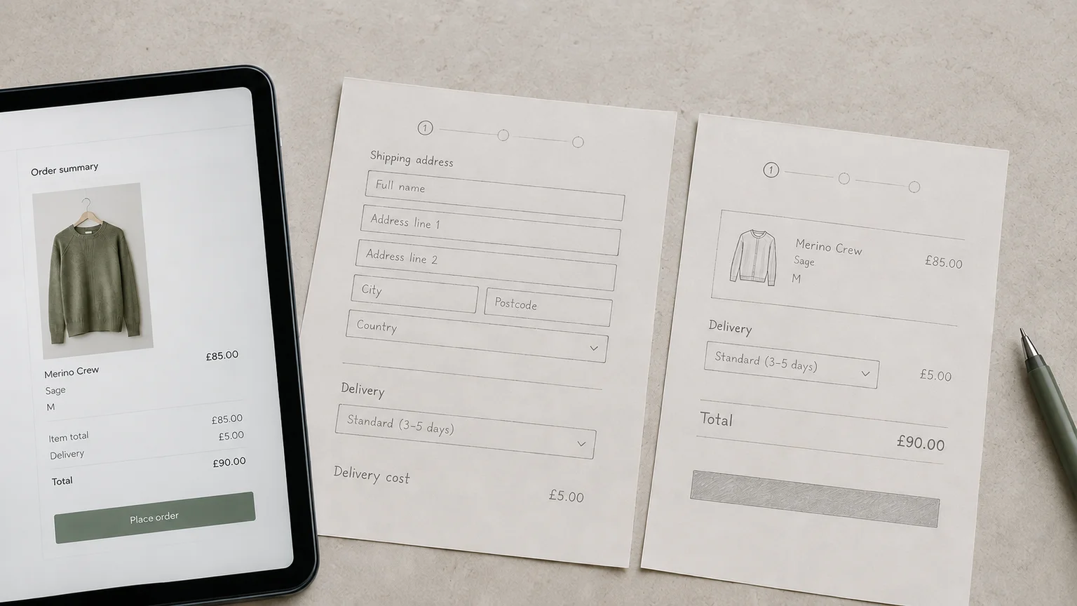
Imagine a fictional store where the delivery charge appears late and the final button says only “Continue.” This is an illustrative example, not a report of Zolve Academy customer research.
Improve the information and sequence
A UX proposal could show a delivery estimate on the product page and the exact charge once the necessary location details are available. If an estimate depends on postcode or order value, explain those conditions. Do not display a precise total before the system can calculate it.
Make the proposal clear on screen
UI work could group item price, delivery and total in a readable summary, keep the selected delivery method visible and give the final action a specific label such as “Place order.” The team must also communicate whether that action charges the customer immediately.
Test the whole task
Ask someone to find a shirt in their size, check when it will arrive and review the full cost before placing an order in a prototype. Observe whether they locate the charge, interpret the estimate and understand the final action. Then refine the design based on what happened.
Visual polish alone would leave the missing information unresolved. A better sequence with tiny labels and ambiguous controls would still be difficult to use. Both kinds of decision influence the outcome, alongside performance, stock accuracy and fulfilment. For more context, read why user experience matters to a business.
05 Common mistakes when comparing UI and UX
- Calling UI decoration: A control's label, state and feedback can determine whether a person understands an action.
- Calling UX the wireframe stage: Experience decisions continue through interface design, testing, implementation and use.
- Assuming fewer clicks always means better UX: A review step may prevent a costly mistake. Evaluate the effort and clarity of the task, not just its length.
- Treating a prototype as proof: It can reveal interaction problems, but it cannot establish real payment reliability, delivery accuracy or production performance.
- Separating accessibility from design: Readable contrast and clear labels matter, and so do keyboard operation and assistive-technology support in the implementation.
The W3C guidance on accessibility, usability and inclusion recommends addressing these concerns together. User testing and accessibility checks complement each other; a successful task in one session does not establish that an interface is accessible.
06 A beginner exercise: improve one checkout decision
Choose a small fictional checkout instead of redesigning an entire shop. Your goal is to help someone understand the delivery choice and final cost.
- Define the user task: “Buy this shirt in medium and check the total cost and expected arrival before ordering.”
- List the information needed: Size, availability, item price, delivery options, estimated arrival and final total.
- Sketch two sequences: Compare where delivery details appear and what information is needed to calculate them.
- Design one interface: Add readable labels, grouped prices and explicit selected and error states.
- Observe a relevant person trying it: Avoid explaining where to click. Record confusion and ask what they expect the final button to do.
- Revise and explain: Connect one observed difficulty to a design change, then note what still needs testing.
Keep a record of your reasoning: “I moved the delivery summary because the participant looked for it before entering payment details” is more useful than “I made the layout cleaner.” Label informal practice honestly and avoid claiming a conversion improvement without measured results.
When you present the work, show the original problem, alternatives, observations and revised screens. Our guide to building a UI/UX portfolio explains how to make those decisions visible.
07 Should you learn UI or UX first?
Start with a user task, then learn enough interface design to make a proposed solution usable. Practise research and task flows alongside typography, spacing, components and prototyping. Testing the result connects the two.
You can specialise later in research, interaction design or visual interface work. At the beginning, ask two questions about every screen: “Does this support the person's goal?” and “Can they understand and operate it?” That habit will make both your work and your explanations stronger.
To practise UI and UX together, explore Zolve Academy's Professional UI/UX Design & AI-Powered Workflow Program. Review the research, user-flow, interface-design and prototyping modules, then use the course enquiry option to discuss how you can turn a small checkout exercise into a project with clear design reasoning.
FAQ
Common questions about UI vs UX: What's the Difference and Why Do You Need Both?
A quick summary of the most common questions readers have about this topic.
UI design shapes the interface people interact with, including layout, controls and feedback. UX design considers the broader experience of achieving a goal, including the task sequence, information needs and service interactions. UI contributes to UX.
No. UI design also makes controls understandable, communicates states and errors, and supports readable, consistent interactions. Appearance matters because it affects how people find and interpret information.
Yes. A designer can work across research, task flows, interface design and testing. Larger teams may divide these responsibilities among specialists. The scope depends on the team and role, so read the actual responsibilities rather than relying on a job title.
Start by understanding a user task, then practise designing its interface and testing the result. Learning both together helps you connect visual choices to user needs. You can specialise as your skills and interests develop.
No. An attractive interface can still hide essential information or lead people through an unsuitable process. Test whether people can complete realistic tasks and check accessibility and implementation separately.