Your screens are arranged neatly in Figma. A learner can see the course details and the enquiry form, but cannot yet experience the path between them. A small prototype turns those static screens into a question you can test: can someone find a course and complete an enquiry without getting lost?
To create your first UX prototype in Figma, choose one user task, put its screens in frames, connect the relevant controls in the Prototype tab, set a flow starting point, then preview and test the journey. You do not need to simulate an entire product. A focused flow gives you clearer feedback and is easier to repair.
This guide is for UI/UX students and career switchers who have basic screens or wireframes and want to make them clickable. The worked example follows a prospective student from a course page to an enquiry confirmation.
Your first prototype checklist
- Write one realistic task and its success condition.
- Prepare a starting screen, the necessary next states and an end state.
- Connect visible controls to the correct destinations.
- Set the flow starting point and preview at the intended screen size.
- Try the flow yourself, then observe someone else using it.
01 Decide what your prototype needs to prove
Before opening the Prototype tab, write a task from the user's point of view. For example: “Find the UI/UX course schedule and send an enquiry about the next available batch.” The success condition is a visible confirmation after the learner submits the relevant details. This is narrower than “make the course website interactive,” and therefore much easier to design and test.
Sketch the route: course listing → course details → enquiry form → confirmation. Add a form error state if a missing field could affect the experience. A user flow helps you see the decisions and recovery paths before you connect screens.
Choose fidelity to match the question. Linked grayscale wireframes can test navigation and content order. More realistic screens are useful when wording, hierarchy or visual cues matter. For a fuller comparison, see wireframes, mockups and prototypes.
02 Prepare frames and states in Figma
Place each screen inside a top-level frame of the same intended device size. Name frames by their role, such as “Course listing,” “Course details,” “Enquiry empty,” “Enquiry error” and “Enquiry success.” Keep the primary path left to right on the canvas so connection lines remain easy to inspect.
Use representative content. If the course date, duration or enquiry prompt is important to the task, generic placeholder lines can hide comprehension problems. Include a clear action label, a way back where users would expect one, and enough information for the person to make the next decision.
For a first prototype, duplicate a frame to show a different state rather than building elaborate logic. One frame may show an incomplete form with an error message; another may show a confirmation. These screens represent outcomes for testing, not real validation or data storage.
03 Connect the first action
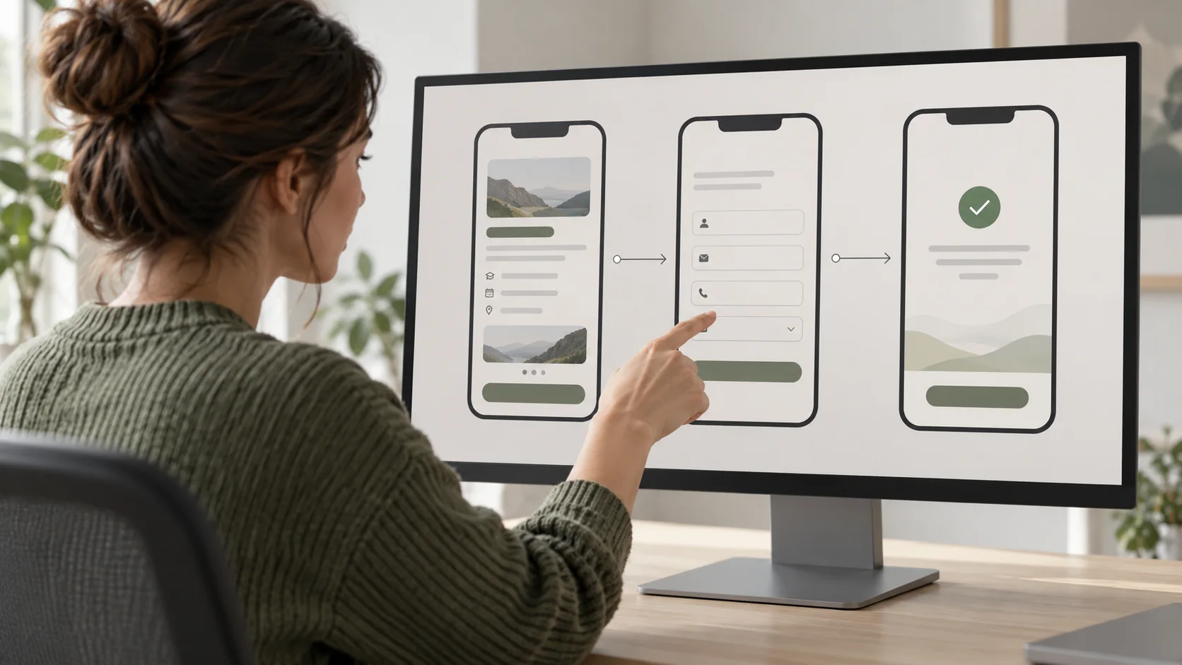
Open the Prototype tab in Figma's right sidebar. Select the button or other element people should use on the first screen. Drag its circular connection handle to the destination frame. In the interaction details, choose the trigger On click and action Navigate to for a basic screen change. The connection should lead from the visible control, not from an unrelated area of the frame.
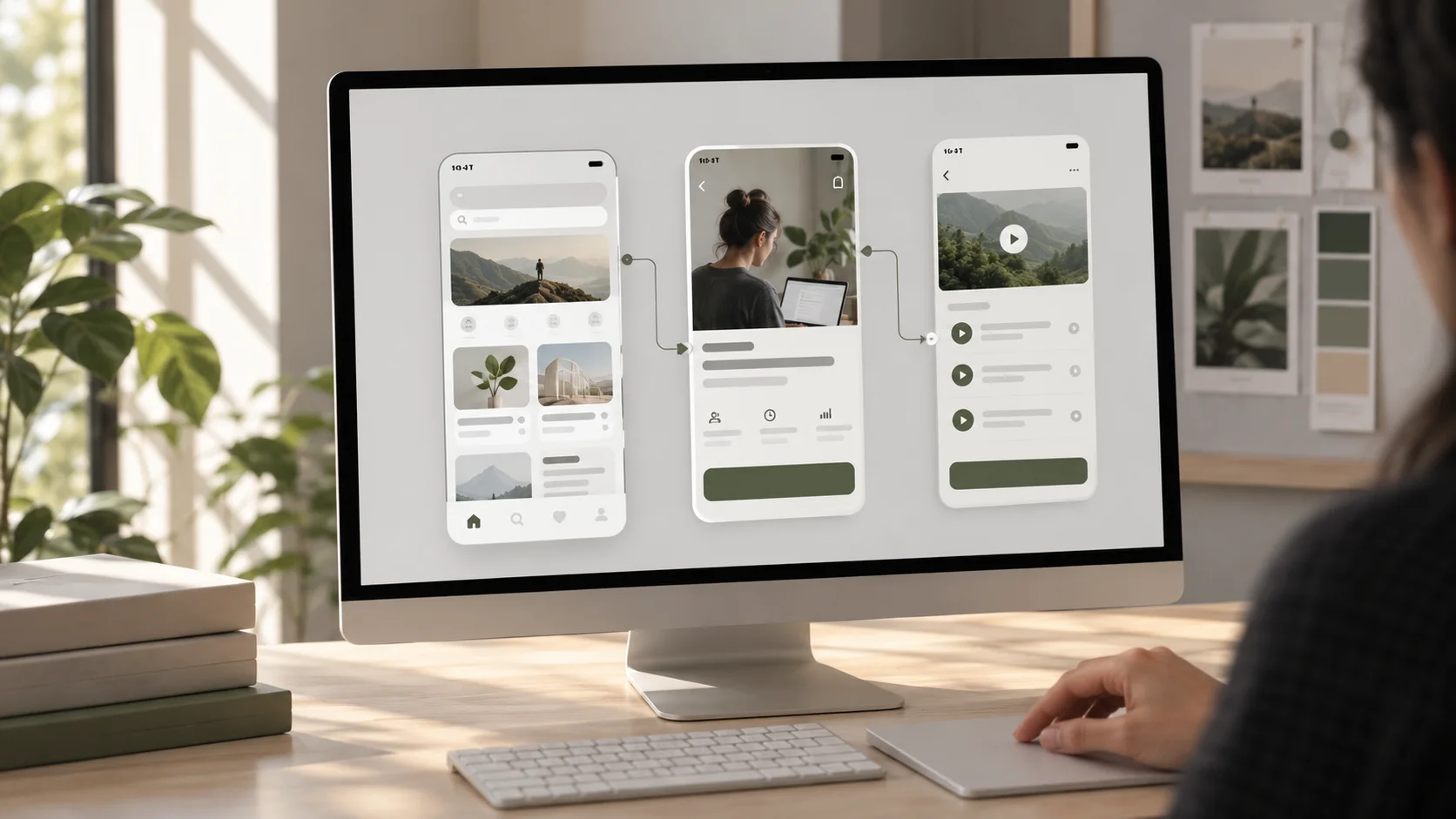
Repeat this for the primary path. In the example, the course card opens details, the enquiry button opens the form, and the submit button leads to a confirmation state. Connect back controls deliberately. If you create an error state, provide a route to correct the form and try again.
Figma supports other triggers, actions, overlays and animations, but start with the simplest interaction that communicates the intended behaviour. A short instant transition is often sufficient to test whether people understand where to go. Add motion only when it clarifies a change or is itself the question being tested.
04 Set the starting point and preview the flow
A flow starting point tells Figma which top-level frame opens first. Figma normally creates one when you make the first connection. Check that it sits on the screen where your task should begin, or add a starting point to the intended frame in the Prototype tab. If your file has several flows, name them by task so reviewers open the right one.
Use Figma's preview or presentation view to run the flow as a participant would. Select a device or preview size that fits your frames. Click every control in order, including back, error recovery and confirmation actions. Do not rely only on the blue connector lines on the canvas; an interaction can look connected and still feel confusing when played.
If the screen should scroll, extend content beyond the frame and set the frame's overflow behaviour in the Prototype tab. Check what stays fixed or moves while scrolling. Figma's scroll and overflow guide explains the setup in detail.
05 Test a task, not just the connections
A working click path is only the technical check. To learn whether the UX works, give someone a realistic goal without pointing to the correct buttons. For example: “You want to ask about the next UI/UX course batch. Show me how you would do that.” Watch where they start, what they expect after each action, where they hesitate and whether they recognise completion.
Keep notes separate from interpretation. “Participant tapped the course image twice before noticing the enquiry button” is an observation. “The CTA has poor contrast” is one possible explanation that still needs review. Look for repeated patterns, revise the relevant screen or route, and test the change again.
Tell participants what the prototype cannot do. If only one course card works, or the form always advances to the same simulated result, say so before the test. A prototype tests selected assumptions; it does not prove that the final product's data, accessibility or technical implementation works.
06 Common first-prototype mistakes
- Connecting every screen without a task: the file becomes a broad demo with no clear question. Build one complete path first.
- Leaving dead ends: a modal, error or confirmation screen has no way forward or back. Walk every branch you expect someone to use.
- Making invisible hotspots: the clickable area does not match the apparent control. Attach the interaction to the button or clearly signalled target.
- Skipping realistic content: placeholder labels prevent you from seeing whether people understand the offer and action.
- Overusing animation: motion draws attention away from the task or makes repeated testing slow. Use it only for a purpose.
- Assuming a successful click means usable UX: observe a person attempting the task without coaching.
- Sharing the wrong flow: check the starting point and open the shared link yourself before sending it.
07 Share what you built and what you learned
When the flow works, use Figma's prototype sharing option to copy the link to the intended flow. Confirm that the recipient can view it and that it opens on the correct starting frame. Include a one-sentence task, the parts that are simulated and the feedback you want. A reviewer who knows the test question can give more useful comments than one who receives only a link.
For a portfolio case study, show the task, a few key frames, the interaction you chose, what happened in testing and what you changed. The prototype is evidence of your design reasoning, not simply a polished animation. Figma's official prototyping guide is a useful reference as you explore additional interactions.
08 Build the smallest believable journey
Your first Figma prototype can be four or five frames. If a learner can understand the offer, open the enquiry form, recover from an error and recognise confirmation, you already have a meaningful flow to evaluate. Improve it from observed behaviour before spending time on extra screens or elaborate transitions.
Want guided practice turning user flows and interface screens into testable prototypes? Explore Zolve Academy's Professional UI/UX Design & AI-Powered Workflow Program, review the course curriculum and use its enquiry option to discuss your starting point.
FAQ
Common questions about How to Create Your First UX Prototype in Figma
A quick summary of the most common questions readers have about this topic.
No. You can connect simple wireframe frames to test a route through a task before polishing the interface. Add only enough content and detail for participants to understand the actions you want to evaluate.
Open the Prototype tab, select the button or other hotspot in the first frame, and drag its connection handle to the destination frame. Set the trigger, such as On click, and the action, such as Navigate to, in the interaction details.
Select the top-level frame where the task should begin and add or confirm its flow starting point in the Prototype tab. Figma also creates a starting point when you make the first connection between frames. Preview the chosen flow to check the opening screen.
A Figma prototype can simulate selected form states and routes, but it is not a working backend or a substitute for testing real data handling. Prepare believable success and error states, then clearly tell participants which parts are simulated.
Run the exact task from the starting frame. Check every expected hotspot, back route, scroll area, error and success state, device size and sharing permission. Ask another person to try the task without guidance, then note where they hesitate or take a different path.