A polished screen can show how a product might look and still reveal almost nothing about whether its structure works. A clickable demo can feel realistic while hiding incomplete content and broken edge cases. That is why wireframes, mockups and prototypes are useful for different reasons.
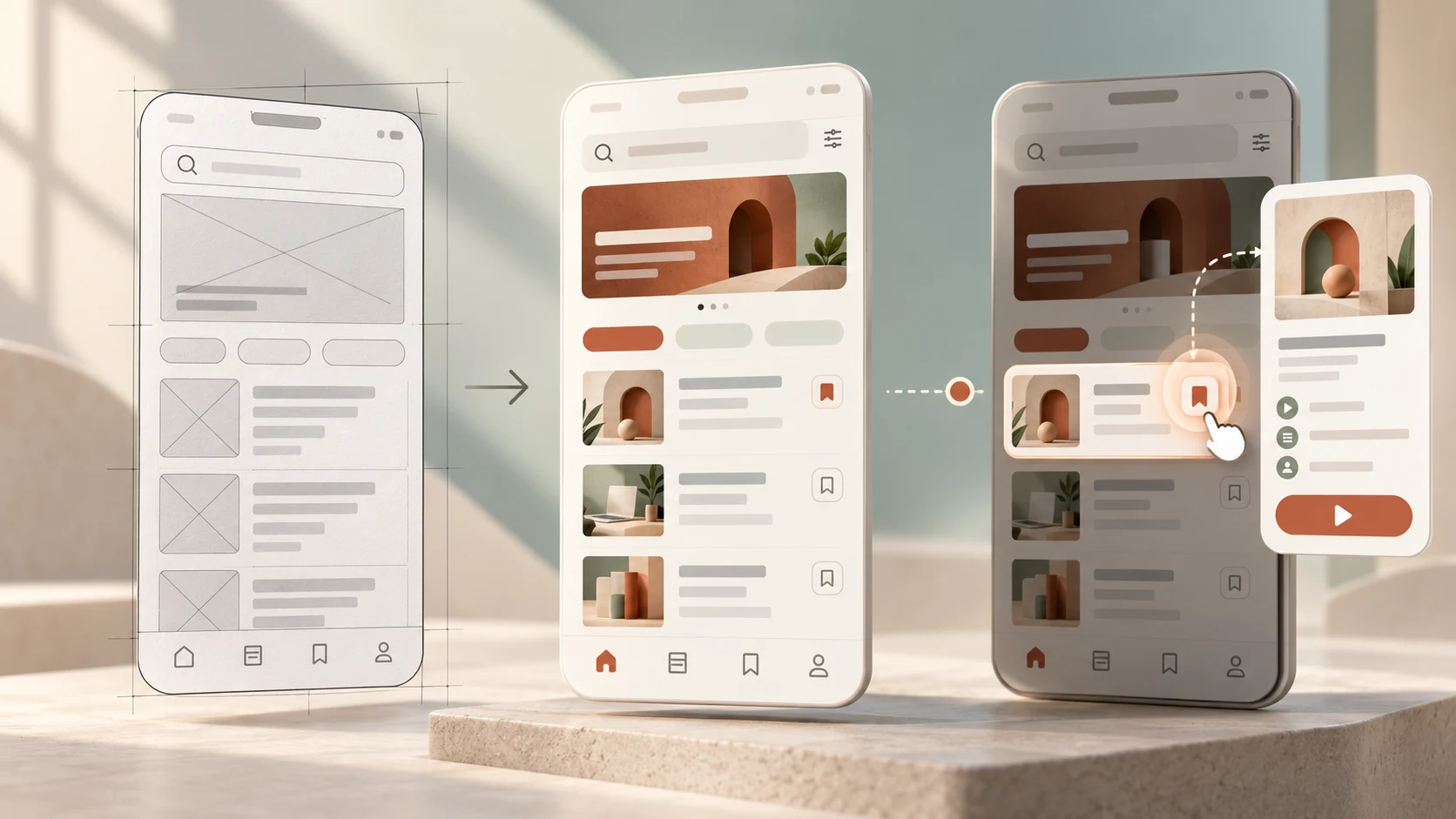
A wireframe communicates structure, a mockup communicates visual appearance, and a prototype simulates behaviour. They are not three quality levels of the same file. Each helps a team answer a different kind of design question.
This guide is for UI/UX students, career switchers and early-stage designers who need to create, review or present these deliverables with confidence. If structural design is new to you, first read our detailed introduction to low-fidelity and high-fidelity wireframes.
The difference at a glance
- Wireframe: shows content, hierarchy, layout, navigation and controls.
- Mockup: shows colour, typography, imagery, spacing and visual style.
- Prototype: lets someone experience actions, transitions, states or a task flow.
- Fidelity: any of the three can contain more or less detail, although mockups are usually visually refined.
- Best choice: use the lightest artefact that can answer the current question.
01 What is a wireframe?
A wireframe is a simplified representation of an interface that makes its content hierarchy, layout, navigation, controls and important states visible. It helps a team decide what belongs on a screen and how people should move through it before final visual styling makes the direction feel settled.
A low-fidelity wireframe may use rough grayscale boxes, labels and lines. A high-fidelity wireframe can use an accurate grid, representative content and detailed component states while still avoiding the final brand treatment.
Use a wireframe to answer questions such as:
- What information does the user need at this point?
- Which action should be easiest to find?
- How should content be grouped and ordered?
- What happens when content is missing, loading or invalid?
- How does the structure adapt to a narrower screen?
A wireframe is not automatically a crude first draft. It can be the clearest artefact for reviewing information architecture, content requirements and responsive behaviour without turning the conversation into a debate about colours.
02 What is a mockup?
A mockup is a static representation of the intended visual design. It shows how layout decisions combine with typography, colour, imagery, icons, spacing and component styling. A mockup can be realistic enough to demonstrate the design direction without behaving like the final product.
Use a mockup to evaluate:
- whether the visual hierarchy supports the content hierarchy;
- how the brand language appears across screens and components;
- whether type, colour and imagery work together coherently;
- how reusable components handle realistic content; and
- whether relevant states and screen sizes feel consistent.
A mockup should not be mistaken for proof that the experience works. It may show a perfect default state while leaving focus order, validation, loading, motion and recovery unspecified. Treat it as evidence about visual presentation, not as a substitute for interaction design or usability testing.
03 What is a prototype?
A prototype is a representation that simulates enough behaviour for someone to experience or evaluate part of a product. It might be a paper flow, linked wireframes, a polished clickable design or a coded experiment. What makes it a prototype is not how attractive it looks, but what it allows the team to learn about behaviour.
A prototype can help answer:
- Can a person complete the intended task?
- Does the navigation match what they expect?
- Do controls provide clear feedback after an action?
- Does a transition explain the change in state?
- Where do people hesitate, make errors or try an unavailable path?
A prototype does not have to model the whole product. A focused prototype of course comparison, form recovery or a complex filter may provide more useful evidence than a broad demo in which every screen is only superficially connected.
04 Wireframe vs mockup vs prototype: the practical comparison
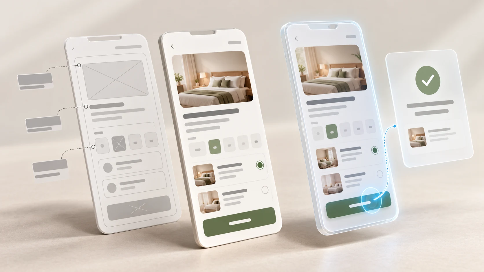
The easiest way to compare the three is to ask what quality of the design each artefact makes testable.
- Primary focus: wireframes focus on structure; mockups focus on presentation; prototypes focus on behaviour.
- Typical interaction: wireframes and mockups can be static; prototypes include some simulated response to input.
- Typical audience: all can be used with designers, developers and stakeholders, while a task-based prototype is often the clearest choice for usability evaluation.
- Cost of change: rough wireframes are usually fastest to revise; detailed mockups and complex prototypes require more effort.
- What they do not prove: none proves that the final product is useful, accessible, technically feasible or ready to ship without further evidence.
The boundaries are not rigid. A visually plain screen can be connected into a prototype. A polished screen can remain a static mockup. A high-fidelity prototype can use the same visual design as the mockups while adding a narrow set of interactions.
05 Fidelity and format are different decisions
Teams often place wireframes, mockups and prototypes on a single ladder from rough to polished. That model is convenient, but it creates confusion. Fidelity describes how closely an artefact represents the intended experience. Format describes what the artefact is designed to communicate or simulate.
Consider these combinations:
- a low-fidelity wireframe drawn on paper to compare three page structures;
- a detailed wireframe with realistic content and error states;
- a polished static mockup showing the approved visual direction;
- a low-fidelity prototype made from linked grayscale wireframes; or
- a high-fidelity prototype with refined visuals, transitions and responsive states.
Name both qualities when sharing work. “Clickable low-fidelity wireframe prototype for testing the course comparison flow” gives reviewers more useful context than “final prototype.” It sets expectations about what is complete and what feedback is needed.
06 Do you need to create all three in order?
Wireframe, then mockup, then prototype is a sensible path for many projects, but it is not a universal rule. The UX design process is iterative. Teams move forward, test assumptions and return to earlier decisions as evidence changes.
You might:
- prototype rough wireframes before choosing a visual direction;
- create a small interaction experiment before designing the surrounding screens;
- move from an established design-system pattern directly to a testable flow;
- build one polished mockup to align on visual language while other flows remain rough; or
- return from usability testing to restructure the wireframe.
Skipping a deliverable is not the same as skipping a decision. If the team does not create formal wireframes, it still needs to resolve content, hierarchy and flow somewhere. If it does not make a clickable prototype, it still needs a suitable way to evaluate behaviour before relying on the implemented product.
07 How to choose the right deliverable
Start with the uncertainty, not the tool. Write the question you need to answer, identify the people who can answer it and choose the minimum realism they need.
Choose a wireframe when structure is uncertain
Use a wireframe when the important debate concerns content, priority, navigation, layout, required states or responsive organisation. Keep it rough when you need alternatives; add detail when realistic content and rules affect the decision.
Choose a mockup when visual direction is uncertain
Use a mockup when reviewers need to judge hierarchy, brand expression, typography, colour, imagery, spacing or consistency. Show relevant screen sizes and states so the visual system is tested under real conditions, not only on an ideal hero screen.
Choose a prototype when behaviour is uncertain
Use a prototype when sequence, feedback, navigation, transition or task completion must be experienced. Build only the paths needed for the question. Clearly explain which controls are functional so test participants do not interpret prototype limitations as design decisions.
08 How the three work together in a practical project
Imagine designing a course discovery and enquiry experience for a learner who is comparing schedule, curriculum and career fit.
- Frame the task. Use research and requirements to define what the learner needs to compare and what the organisation needs before responding to an enquiry.
- Explore with wireframes. Compare list-first, guided and side-by-side structures. Include missing schedule data, validation and mobile layouts.
- Review the structure. Check whether the content order and actions support the learner's decision before refining the visual style.
- Create selected mockups. Apply typography, colour, imagery and components to the strongest direction, using realistic course content.
- Build a focused prototype. Connect course discovery, comparison, enquiry, error recovery and confirmation states.
- Test and revise. Observe whether participants find the right information, understand the comparison and recover from errors. Update the structure, visuals or behaviour according to the issue.
This workflow preserves the connection between evidence and execution. The detailed guide on turning UX research into design decisions can help you document why a particular structure or interaction was selected.
09 What to test with each artefact

Match the feedback method to what the artefact can honestly demonstrate.
- With a wireframe: review hierarchy, terminology, content completeness, navigation, states and responsive priorities.
- With a mockup: review visual hierarchy, consistency, readability, brand fit and how the design handles realistic content.
- With a prototype: give participants a realistic task and observe actions, hesitation, errors, expectations and recovery.
Do not ask a static mockup to prove that a flow is usable, or ask a rough wireframe for final opinions on brand personality. Explain the fidelity, the scenario and the open decisions before a review. Better framing produces more relevant feedback.
10 Common mistakes and how to avoid them
- Using the terms interchangeably: reviewers do not know whether to discuss structure, visual style or behaviour. Name the artefact, fidelity and question.
- Polishing before resolving structure: colour and imagery make an early direction feel more complete than it is. Compare structural alternatives first when the structure is uncertain.
- Calling a screen collection a prototype: a set of mockups does not simulate interaction simply because several states exist. Connect the relevant actions and responses.
- Prototyping every path: effort goes into breadth instead of the risky behaviour. Define the test task and build the smallest believable path around it.
- Testing with placeholder content: generic lines conceal comprehension, length and prioritisation problems. Use representative labels and information.
- Showing only the ideal state: loading, empty, error, permission and success experiences remain unresolved.
- Confusing a prototype with production: a smooth demo does not guarantee accessibility, data integrity, performance or technical feasibility. Review these with the relevant specialists.
- Treating approval as evidence: stakeholder preference can align a direction, but it does not replace observation of relevant users completing realistic tasks.
11 How to present wireframes, mockups and prototypes in a portfolio
A portfolio should not look like an archive of every file produced. Select artefacts that reveal how your understanding and decisions changed.
- Introduce the user, problem, context and your role.
- Show two or three wireframe alternatives and explain the trade-offs.
- Use selected mockups to demonstrate how the visual system supports the experience.
- Link or record the prototype if interaction is important to the story.
- Explain what you tested, what you observed and what changed afterward.
- State limitations honestly, including prototype shortcuts and unresolved questions.
The strongest evidence is not a perfectly linear process. It is clear judgement: choosing an appropriate artefact, learning from it and revising the design for a reason. This is part of what UI/UX designers actually do when they connect research, interface decisions and collaboration.
12 Start with the decision, then choose the deliverable
Wireframes, mockups and prototypes are valuable because they make different aspects of a proposed experience visible. A wireframe helps you question structure. A mockup helps you evaluate visual communication. A prototype helps you experience behaviour.
Do not create all three merely to complete a design-process checklist. Identify what is uncertain, select the lightest useful representation, gather the right feedback and increase fidelity only when more realism improves the next decision. That approach saves effort while producing stronger design reasoning.
Want to practise moving from research and user flows to wireframes, interface design, prototypes and usability testing? Explore Zolve Academy's Professional UI/UX Design & AI-Powered Workflow Program, review the curriculum and use the course enquiry option to discuss your starting point and project goals.
FAQ
Common questions about Wireframes vs Mockups vs Prototypes: What's the Difference?
A quick summary of the most common questions readers have about this topic.
A wireframe focuses on structure, hierarchy and required content. A mockup shows the intended visual appearance in a static form. A prototype simulates interaction so people can move through a task or experience states and transitions. The terms can overlap, so teams should also state the fidelity and purpose of the artefact.
Not always. A team may sketch a wireframe before creating a visual mockup, but it can also prototype a rough flow with wireframes, test one risky interaction early or move directly to a familiar component pattern. The right sequence depends on the uncertainty and decision, not a fixed checklist.
A wireframe and a prototype describe different qualities. A wireframe describes the screen's structure, while a prototype describes simulated behaviour. When several wireframes are linked into a clickable flow, the result can be both a wireframe and a low-fidelity prototype.
A mockup is usually a static representation of the intended visual design. It may show multiple states, but it does not need to respond to input. If those screens are connected so a person can perform actions and experience changes, the artefact is functioning as a prototype.
Include the artefacts that best explain your decisions. A few purposeful wireframes can show structural reasoning, selected mockups can demonstrate visual craft, and a prototype can show how the experience behaves. Add context about the problem, evidence, alternatives, testing and revisions instead of presenting screens without explanation.