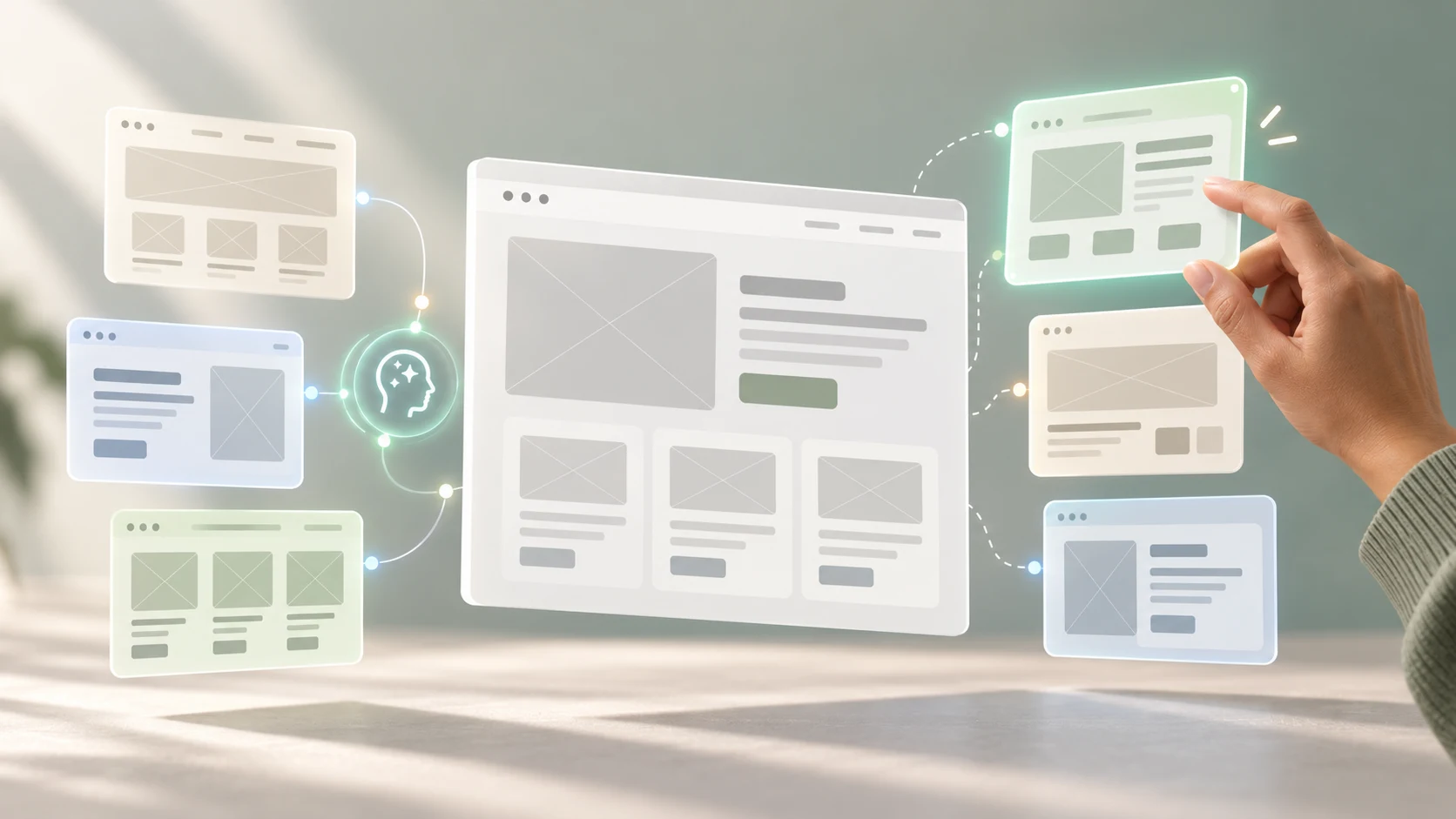
A blank canvas can make the first layout feel unusually important. AI can break that spell by producing starting points in seconds. The danger is that a fast, polished suggestion can also make an ordinary idea feel more certain than it deserves.
AI is most useful in early UX design when it helps you widen the design space, make rough ideas tangible and critique assumptions before you invest in polish. It can propose alternatives and assemble first-pass wireframes. It cannot decide which problem matters, which evidence is trustworthy or which experience should be built.
This guide is for UX students, career switchers and working designers who want a practical way to use AI for ideation and early wireframing. If wireframes themselves are new to you, begin with our guide to low-fidelity and high-fidelity wireframes.
AI-assisted ideation at a glance
- Ground the work: begin with a user, problem, evidence and constraints.
- Diverge deliberately: request different structures, not cosmetic variations.
- Keep fidelity low: explore hierarchy, content and flow before visual style.
- Critique the output: inspect assumptions, missing states, accessibility and feasibility.
- Converge with reasons: combine or reject ideas using explicit criteria.
- Prototype the risk: test the uncertain part with relevant people.
01 Where AI helps in UX ideation
UX ideation is the process of generating, developing and comparing possible responses to a defined user problem. The aim is not to produce the largest number of screens. It is to avoid committing to the first plausible answer before the team has explored meaningful alternatives.
AI can help with several parts of that work:
- reframe a design question from different user or service perspectives;
- propose alternative content groupings, interaction models and screen structures;
- turn a written task flow into a first-pass set of screens;
- suggest empty, loading, error, success and recovery states;
- challenge a preferred concept with counterarguments and edge cases;
- rewrite unclear labels or placeholder content for a rough layout; and
- summarise trade-offs so the team can compare ideas consistently.
These are acceleration tasks, not authority. AI tends to produce familiar patterns because familiar patterns are well represented in its inputs. That can be helpful for a standard search, checkout or onboarding screen. It can also narrow the work if the actual problem needs a different service, policy or content response rather than another interface.
02 Start with a design brief, not a blank prompt
“Create a wireframe for a course website” does not define a user need or decision. The tool must invent the audience, priority, content and desired action. The result may look coherent while resting on assumptions no one chose.
Prepare a compact brief before asking for ideas:
- User and context: who is doing the task, and under what conditions?
- Goal: what outcome are they trying to reach?
- Evidence: which observations, research themes or verified requirements matter?
- Content: what information and actions must the experience include?
- Rules: what permissions, validation, business or service conditions apply?
- Constraints: which devices, accessibility needs and technical limits matter?
- Risk: what assumption would be costly or confusing if it were wrong?
- Question: what specific decision should this round of ideation support?
Separate evidence from assumptions in the brief. “Participants looked for class timing before opening the curriculum” is an observation. “Put the schedule in a fixed panel” is one possible response. AI should help explore responses without quietly converting one interpretation into a fact.
The earlier guide on turning UX research into design decisions explains how to move from observation to insight, opportunity and testable hypothesis without breaking that chain.
03 Use AI to create genuine alternatives
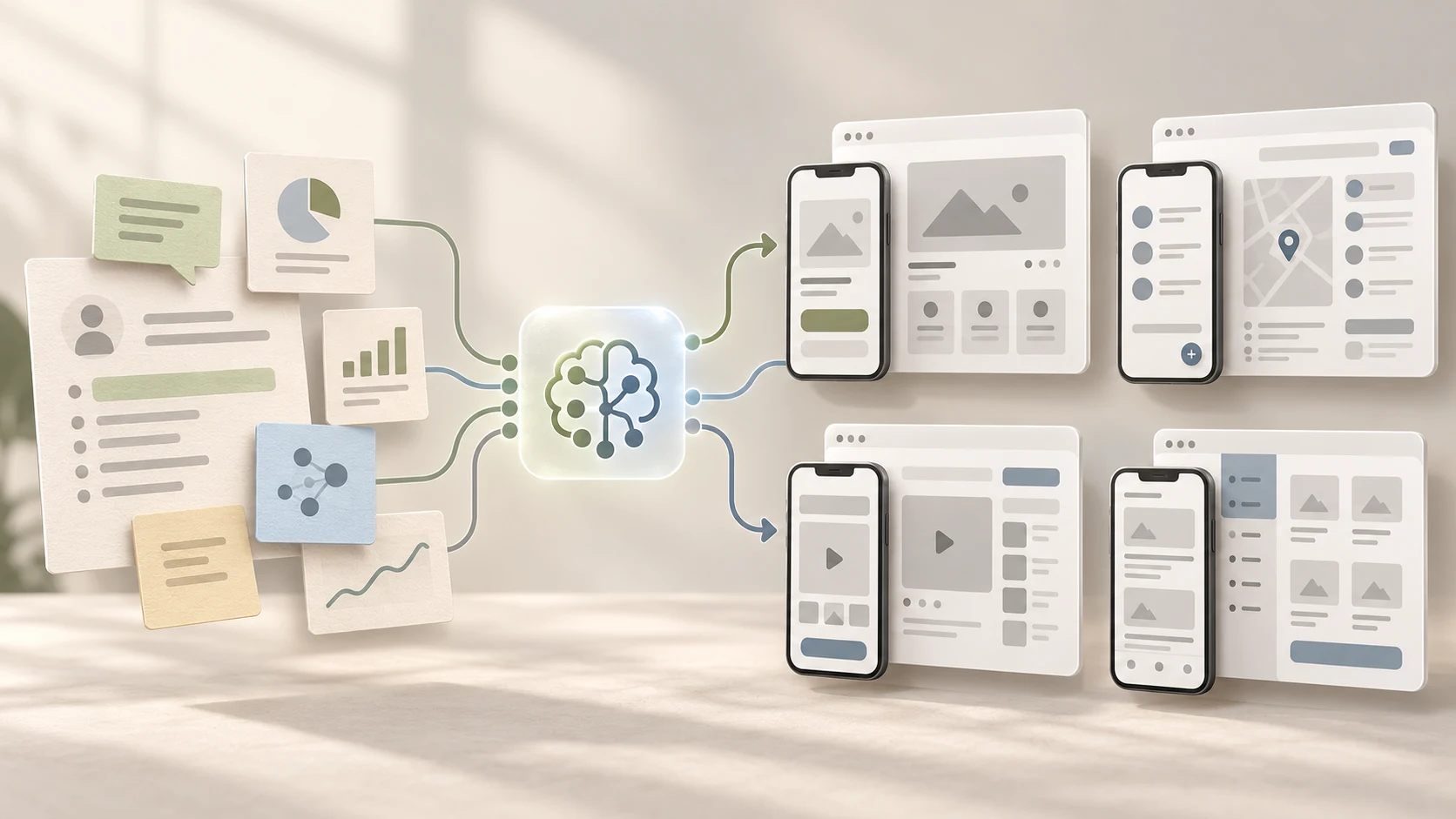
Generating more screens is not the same as generating more ideas. Four homepages with the same hero, cards and call to action are one structural idea wearing four visual outfits.
Ask AI to vary a dimension that affects the experience:
- Sequence: compare overview-first, guided and task-first structures.
- Disclosure: compare showing all information with revealing it as needed.
- Navigation: compare page-based, step-based and hub-based approaches.
- Decision support: compare filters, side-by-side comparison and recommendation questions.
- Input: compare free entry, structured selection and a mixed approach.
- Recovery: compare inline correction, review-before-submit and save-and-return patterns.
Request three or four options, then ask the tool to explain the user benefit, trade-off, assumption and likely failure of each. This makes differences easier to evaluate and reduces the chance that the most attractive rendering wins automatically.
04 A practical AI-assisted ideation and wireframing workflow
Step 1: frame the opportunity yourself
Write a focused “How might we” question or design challenge. For example: “How might we help a career switcher compare course commitment and learning outcomes before deciding whether to enquire?” Check that the question leaves room for more than one response and does not hide a preferred layout.
Step 2: sketch one or two ideas without AI
A few minutes of independent sketching protects your own interpretation of the problem. The sketches do not need to be good. They give you a baseline and make it easier to notice when generated suggestions simply repeat familiar conventions.
Step 3: ask AI for structured divergence
Provide the brief, not confidential raw research, and request alternatives that vary in a named way. Tell the tool to use only supplied facts, state assumptions and mark questions that need research or product input. Text output is often enough at this stage because it is fast to challenge and rearrange.
Step 4: turn selected directions into low-fidelity wireframes
Translate promising concepts into rough screen structures. Some tools can generate an editable starting point directly. For example, Figma documents that its AI-assisted first-draft workflow uses built-in libraries to create editable wireframes or designs from descriptions, while also noting limitations for concepts outside common website and mobile patterns. Tool capabilities change, so treat the feature as a way to start exploring rather than a source of product truth.
Keep the output deliberately plain. Use representative headings, labels and data lengths, but avoid spending time on brand colour, imagery and decorative components. Early wireframes should expose the structure, not make an unresolved idea look finished.
Step 5: annotate assumptions and missing states
Mark what the tool invented. Add empty, error, loading, permission, interruption and success states where relevant. Note responsive changes, content dependencies and behaviour that a still frame cannot show. If a generated screen assumes data or a service capability that does not exist, record it instead of designing around it silently.
Step 6: critique before you refine
Review each direction against the same criteria. Ask AI for a critique if useful, but verify the critique yourself. Involve content, development, product and accessibility expertise when their constraints shape the decision.
Step 7: combine, redraw and document the decision
You do not have to choose one generated option unchanged. Combine a strong content hierarchy from one direction with the recovery behaviour of another, then redraw it intentionally. Record what you kept, rejected or changed and why. The final wireframe should belong to the design reasoning, not to the prompt history.
Step 8: prototype and test the riskiest assumption
Connect only the screens and states needed to investigate the important uncertainty. If the risk is whether people understand two course formats, test that comparison. If the risk is recovering from incomplete information, prototype that route. Follow the wider UX design process: make the hypothesis tangible, evaluate it and revise.
05 Prompt patterns that support better design thinking
A useful prompt gives context and requests a thinking task. It does not merely ask the tool to make something “modern” or “user-friendly.”
Explore different structures
“Using the supplied brief, propose three meaningfully different structures for this task. Vary the sequence, information grouping and decision support. For each, list the user benefit, trade-off, unsupported assumption and question to test. Do not add product capabilities that are not in the brief.”
Create a low-fidelity screen specification
“Turn option B into a low-fidelity screen list. For each screen, include its purpose, required content, primary action, secondary actions, navigation, system response and important states. Use realistic placeholder labels. Leave visual styling unresolved.”
Critique a wireframe
“Review this wireframe against the original user evidence and task. Identify unclear hierarchy, missing content, hidden assumptions, accessibility risks, edge cases and behaviour that needs annotation. Separate issues visible in the wireframe from questions that require research or specialist review.”
Challenge the preferred direction
“Assume the team wants to select option C. Make the strongest case against it. Which users, contexts or system conditions could it disadvantage? Which evidence supports or weakens those concerns? What must be tested before commitment?”
Run these prompts in stages. One request that asks AI to research, define, ideate, design and evaluate the solution hides too many decisions inside one confident response.
06 How to evaluate an AI-generated wireframe
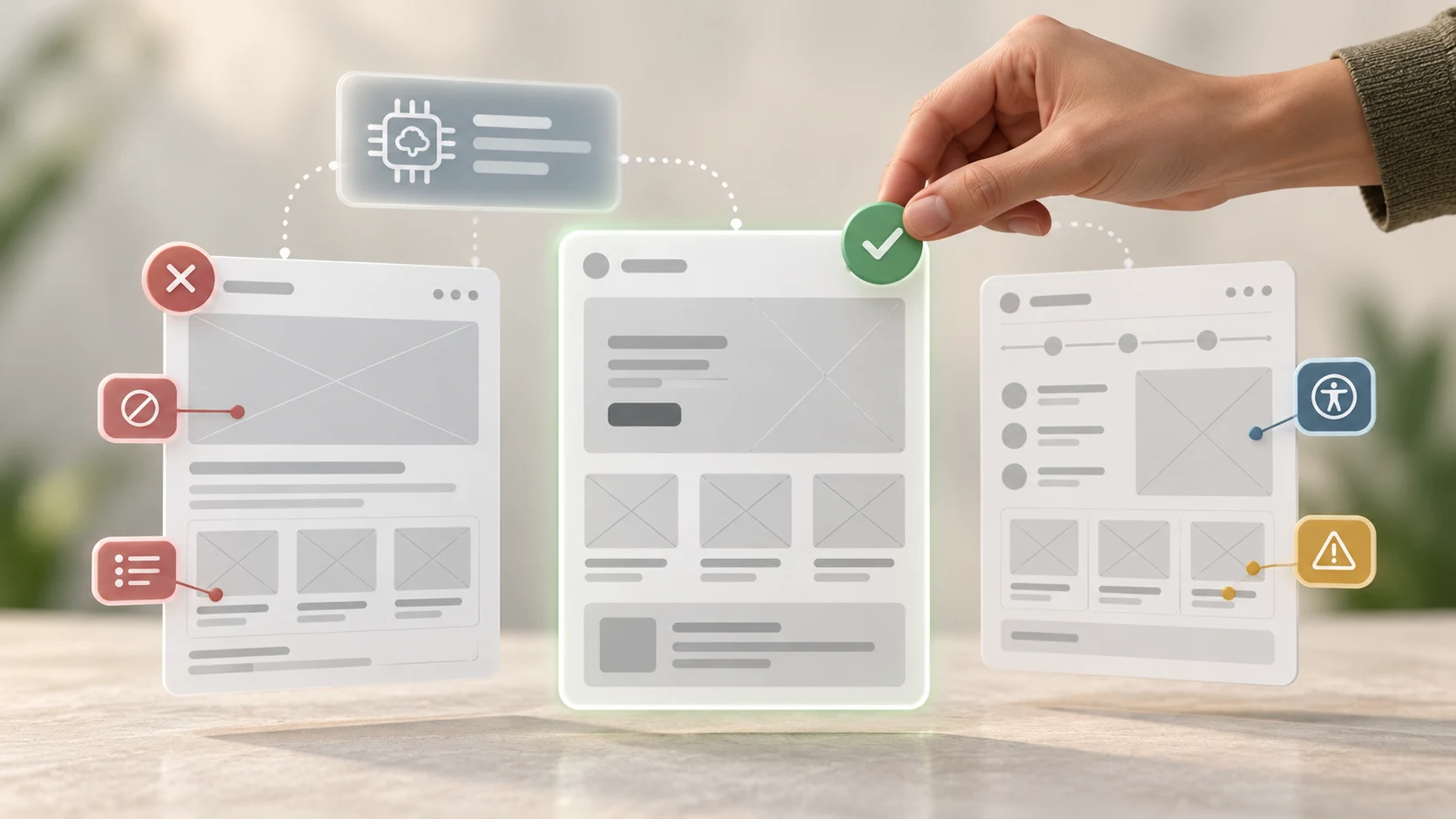
An AI-generated wireframe is good only if it helps answer the current design question. Use a review checklist that covers more than appearance:
- Evidence: can important elements be connected to a user need, requirement or declared assumption?
- Task: is the purpose clear, and can the user tell what to do next?
- Hierarchy: does the order and emphasis match the decisions the user needs to make?
- Content: are labels and examples representative enough to test the layout?
- States: are loading, empty, error, success, cancellation and recovery covered where necessary?
- Accessibility: is the reading order logical, are controls understandable and does the interaction avoid relying on colour or pointer use alone?
- Responsiveness: what changes when space, content length or input method changes?
- Feasibility: can the product and service support the data, rules and response implied?
- Testability: which uncertain behaviour can be examined in a prototype?
A neat wireframe can fail this review. A rough sketch can pass it. Fidelity and quality are different things.
07 Keep research, privacy and ownership in view
Do not paste raw interview transcripts, names, contact details, health information, confidential requirements or unreleased product material into an AI tool by default. Check your organisation's approved tools, account type, retention settings, contracts and policies. Minimise and de-identify inputs, but remember that unusual combinations of context may still identify someone.
The same caution applies to images, interface files and client work. Confirm that you have permission to upload the material and understand how generated output may be used. Keep a record of source assets and human decisions when provenance matters.
If your inputs come from research, review our guide to using AI in UX research responsibly. The safest beginner exercises use fictional briefs and non-sensitive content created for practice.
08 Common mistakes in AI-assisted ideation
- Starting with a solution-shaped prompt: “Design a dashboard” closes off the possibility that another structure would serve the task better.
- Accepting the first output: speed should create room for alternatives, not rush the team into convergence.
- Confusing variation with divergence: different colours, images or card shapes do not create a different experience.
- Letting AI invent evidence: generated users, quotations and preferences are hypotheses, not research findings.
- Increasing fidelity too soon: polished components can make weak hierarchy and missing states harder to question.
- Designing only the happy path: real experiences include delays, errors, interruptions and recovery.
- Ignoring content: anonymous rectangles hide whether labels, instructions and data can actually work.
- Skipping accessibility and feasibility review: a plausible screen can still create barriers or promise behaviour the service cannot deliver.
- Using unapproved sensitive inputs: convenience does not remove privacy, confidentiality or ownership responsibilities.
- Hiding the rationale: keep enough of the brief, alternatives and decision record to explain why the final direction changed.
09 A beginner exercise: brief, diverge, wireframe, test
Choose a contained task such as finding a suitable class, booking an appointment or changing a delivery time. Create a fictional brief with one clear user goal, five content requirements, two constraints and one known risk.
- Sketch one solution yourself in ten minutes.
- Ask AI for three structurally different approaches and their trade-offs.
- Mark every assumption that was not supplied in the brief.
- Select two directions and build low-fidelity wireframes with representative content.
- Add an error, interruption and narrow-screen state to each.
- Review both against evidence, clarity, accessibility and feasibility.
- Combine or select a direction, then write the reason for each major choice.
- Create a small clickable prototype and run a task-based usability session.
Keep the initial sketch, AI suggestions, rejected ideas and tested revision together. That process makes a stronger case-study story than presenting the generated screen as the achievement. It shows that you can use a tool while remaining accountable for the design.
10 Let AI accelerate exploration, not replace judgment
AI can make early ideas cheaper to express. That is valuable when the saved time is used to explore a wider range of options, improve the brief, cover neglected states and test risky assumptions.
The responsible sequence is simple: define the problem, protect the inputs, generate alternatives, keep the work rough, critique the assumptions, choose with reasons and validate with people. AI can accelerate several steps. The designer still connects them into a trustworthy process.
Want to practise research, ideation, wireframing, interface design, prototyping and AI-assisted critique as one connected workflow? Explore Zolve Academy's Professional UI/UX Design & AI-Powered Workflow Program, review the curriculum and use the course enquiry option to discuss your starting point and project goals.
FAQ
Common questions about How AI Can Help With UX Ideation and Early Wireframing
A quick summary of the most common questions readers have about this topic.
Yes. Some AI tools can turn a written brief into a rough screen structure or editable wireframe. The output is a starting hypothesis, not a validated solution. A designer still needs to check the content, hierarchy, states, accessibility, feasibility and connection to user evidence.
Include the user, task, context, evidence, required content, business rules, platform, constraints, important states and the design question you need to answer. Ask the tool to state assumptions and generate meaningfully different options rather than one polished screen.
It is often useful to sketch at least one option yourself first. This protects independent thinking and gives you a baseline to compare with AI suggestions. You can also use AI first when you are blocked, provided you deliberately challenge its framing and explore alternatives afterward.
No. AI can reorganise the information you provide, suggest familiar patterns and expose possible gaps, but it cannot prove what real users need or whether they can use the proposed interface. Research grounds the problem, and testing evaluates the design hypothesis.
Evaluate it against user evidence, task clarity, content needs, information hierarchy, accessibility, edge cases, technical constraints and the risk you need to test. A useful wireframe makes the next decision clearer; visual neatness alone is not evidence of quality.